Disclaimer: This post contains affiliate links, which means I make a small commission when you make purchases through them.

Product Details
The Natasha Denona Bronze Palette contains 15 shades mostly concentrated in the gold, orange, and red color families. 9 of them are shimmers, 5 are matte, and one of the shades (Deep Dive) is a cream/powder hybrid with a nearly matte finish. It retails for $65 and contains a total of 19.25 grams / 0.67 oz of product.
Formula Overview
The 5 mattes that are true powder shadows are very similar to the matte shades in the Too Faced Pumpkin Spice Palette (see review). They are highly pigmented and take some time to blend but they blend out well. The matte shade that took the most time and effort to work with was Magma, which looked best when used together with one of the lighter transition shades. Where they differ from Too Faced is how they apply. Because of the color payoff, the looks that come out of this palette tend to be more intense. It takes more time soften up the color than it does to build it up, if that makes sense.
The cream/powder hybrid shade has a very slight satiny sheen but on the eye it reads as matte. It is sheerer than the other true matte shades and blends out more quickly and easily. It can be built up to a degree but I find it difficult to get it to look true-to-pan on the eye. This shade creases quickly on me.
The shimmers vary in their finish, ranging from a sheer sparkly wash to foiled. There was shimmer fallout from most of the shades, which is to be expected. True Bronze and Silk, being flakier types of shimmers, had the most fallout. Most of the shimmer shades applied fine with a brush. The two sheerest shades, Rhodium and Bliss, could be applied with a brush but the color would go on much sheerer than you see in the swatches. Especially with Rhodium, to get that blue sheen to really show up, you really have to pack it on.
Shade Selection
After struggling with this palette for a bit, I have found it is more versatile than you might think but there are still some shades I think are too similar to each other. Sundown and Ridge are different enough in swatches or when applied very heavily but if used as transition shades, they essentially look the same. True Bronze and Silk have slightly different finishes but look so similar on the eye. I prefer shimmery shades to have more variation because the light that reflects off them kind of dulls out whatever color they are.
Wear Time
I got a pretty consistent 7 hours of wear out of these shades when worn over Nars Pro Prime Tinted Eyeshadow Primer. By that point I would begin to see minor creasing. For me, that is better than average but not the longest wearing ever.


Looks

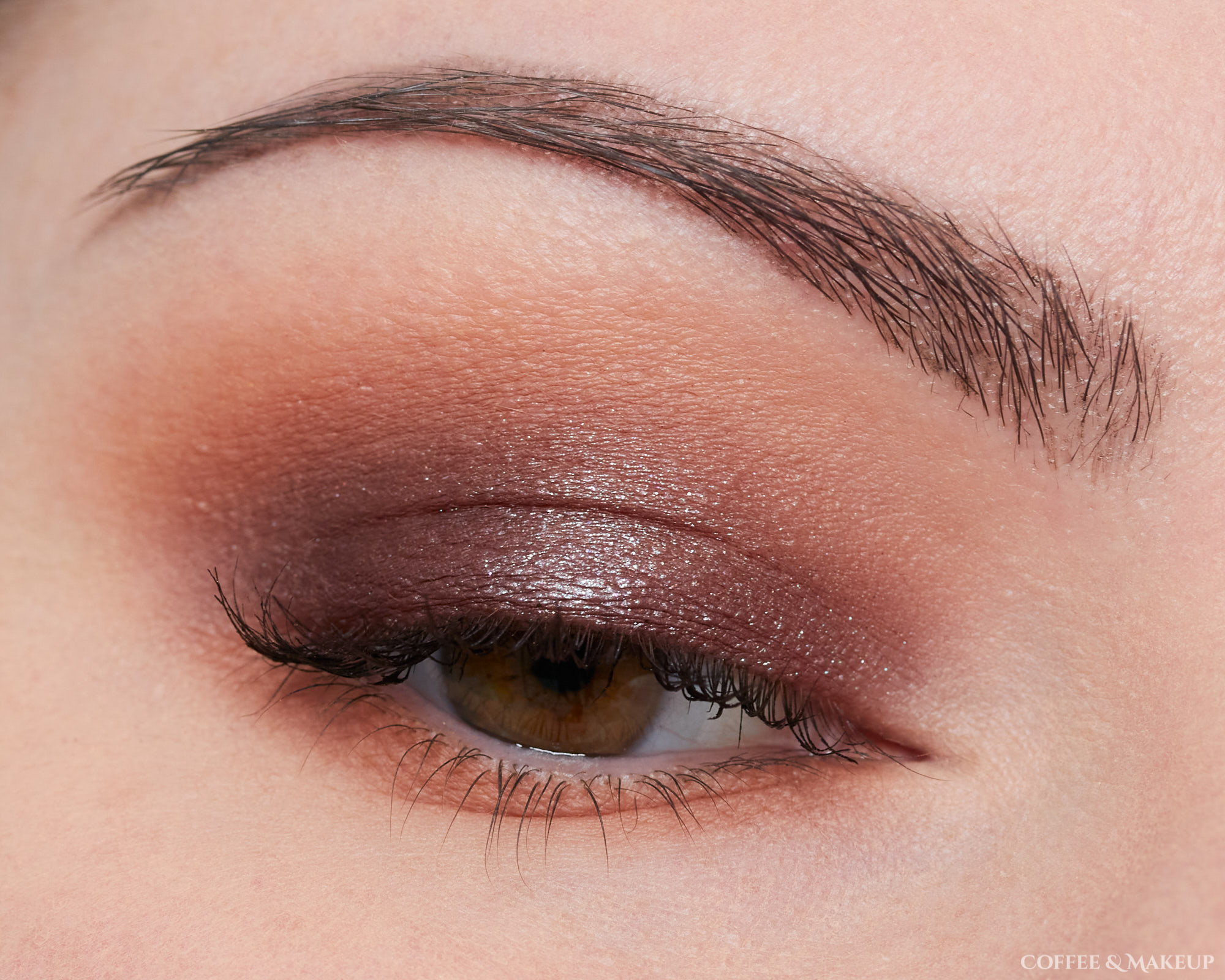
Look #1
- Deep Dive – All over lid + blended into crease, lower lashline
- True Bronze – Center of lid

Look #2:
- Beach – Crease, lower lashline
- Bliss – All over lid
- Deep Dive – Worn as eyeliner
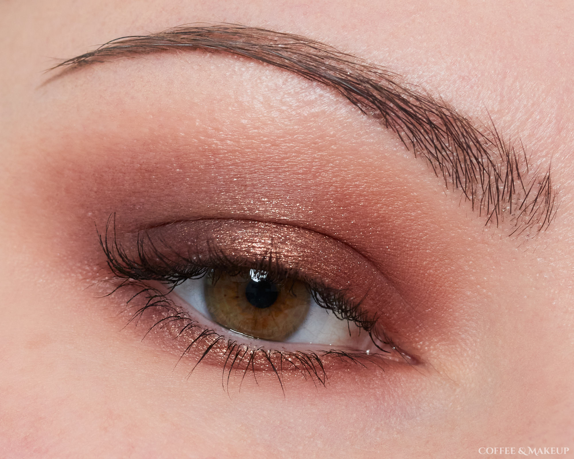
Look #3:
- Beach – Crease, lower lashline
- Deep Dive – All over lid
- Rhodium – Layered over Deep Dive

Look #4:
- Sundown – Transition, lower lashline
- Suntan – Crease
- Magma – Inner/outer lid
- Alloy – Center of lid

Look #5:
- Magma – Above crease, lower lashline
- Beach – Blended the top portion of Magma with this
- Silk – All over lid, crease, a little on lower lashline

Look #6:
- Ridge – All over lid + blended into crease, lower lashline
- Gloaming – Layered all over lid
Look #7:
- Deep Dive – Outer lid/crease, outer lower lashline
- Magma – Inner lid/crease, inner lower lashline
- Beach – Blended around edges of previous two shades with this
- Palladium – Center of lid and lower lashline

Look #8:
- Magma – Inner/outer lid and crease
- Sundown – Center of lid and crease, transition area
- High Degree – Inner and outer lower lashline
- True Copper – Center of lower lashline
- Silk – Inner corner, brows, also applied over top True Copper on the center of the lower lashline to add more brightness. After applying it to the inner corner, I took whatever residual was still on the brush and lightly dusted it over the brow bone area.