Disclaimer: This post contains affiliate links, which means I make a small commission when you make purchases through them.


The Natasha Denona Yucca Palette came out around 2 months ago and I almost picked it up at launch but held off for a bit. I’m kind of a sucker for green-themed palettes and this one looked right up my alley and not too similar to other palettes I already had in my collection. There isn’t actually all that much overt green in here besides the emerald on the bottom right and the sparkling shimmer called Makia. There are shades in here that veer far enough toward the edges of what I consider green that I consider it more of a neutral palette with hints of green.
It has 15 shades that I would categorize into 4 formulas. There are 8 powder mattes, 2 creamy powders, 4 sparkly metallics, and 1 high-shine standard shimmer.
After several days playing with the palette and trying every shade, I am happy overall with the quality, the shade selection, and ease of application. I haven’t used my older Natasha Denona palettes in months but from memory they weren’t as easy to use mainly because of the intense level of pigment and how well the shadows adhered to the skin. It seems to me that some of the formulas in this palette are slightly different/updated, especially the powder mattes and one of the creamy powders.
Plantasia


Plantasia has a sheer bronze base with a lot of highly reflective sparkle that gives off a metallic sheen when applied heavily. The sheen shifts from greenish gold in direct light to pinkish purple in angled light. It is pretty easy to see the shift in person but not as much in photos and as far as shifty shades go in general, this one is on the more subtle side.
Calathea

Calathea is a cool-toned medium olive and is one of two creamy powders in the palette. In the pan, this looks like a deep grey. I had no idea it was green till I put it on the eye. It is lighter/sheerer than you might expect but can be built up to a decent amount of depth and it blends out very nicely.
Komorebi


Komorebi is a sparkly metallic, bright greenish gold. There are a few specks of shifty sparkles that are vaguely noticeable and they go from pink to blue depending on the angle of the light. They are easier to see in real life than in photos but can be seen when they are not perfectly in focus. The metallic sheen is a bit more opaque in this shade than in Plantasia.
Acacia

Acacia is a warm khaki brown with a subtle greenish tinge. It is nearly identical to Tipu in the second row but that one is ever so slightly more golden. Easy to blend with buildable color payoff. This and all the other powder mattes in this palette have a similar, less pigmented quality than mattes in older palettes. I find this to be a good thing because it makes them easier and faster to work with.
Camu Camu
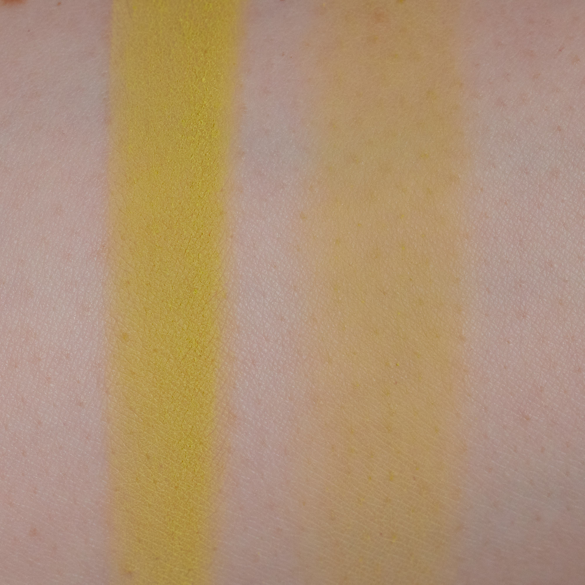
Camu Camu is a yellowy lime green somewhere between a neon and a pastel. Not too sheer, shows up quickly without too much layering.
Tipu

Tipu is a light golden khaki. It has a strong warm tone once blended but stays true to color as it is sheered out.
Elysian


Elysian is a medium silvery taupe with a sparkly metallic finish. It looks like a subtle deep grey base color and a lot of fine shimmer form the majority of the shade with fewer larger sparkles than some of the other shimmers.
Valley

Valley is a medium brown with strong orange tones. Works as a warm neutral without becoming too orange.
Citrine

Citrine is a mustard that leans very green.
Ray


Ray is a light gold with subtle green tones and is the only shimmer of its type in the palette. Compared to the rest, it has a smoother finish and is slightly less reflective with finer particles and much less fallout. It is similar in color to Komorebi but is a bit deeper and more yellow.
Flax
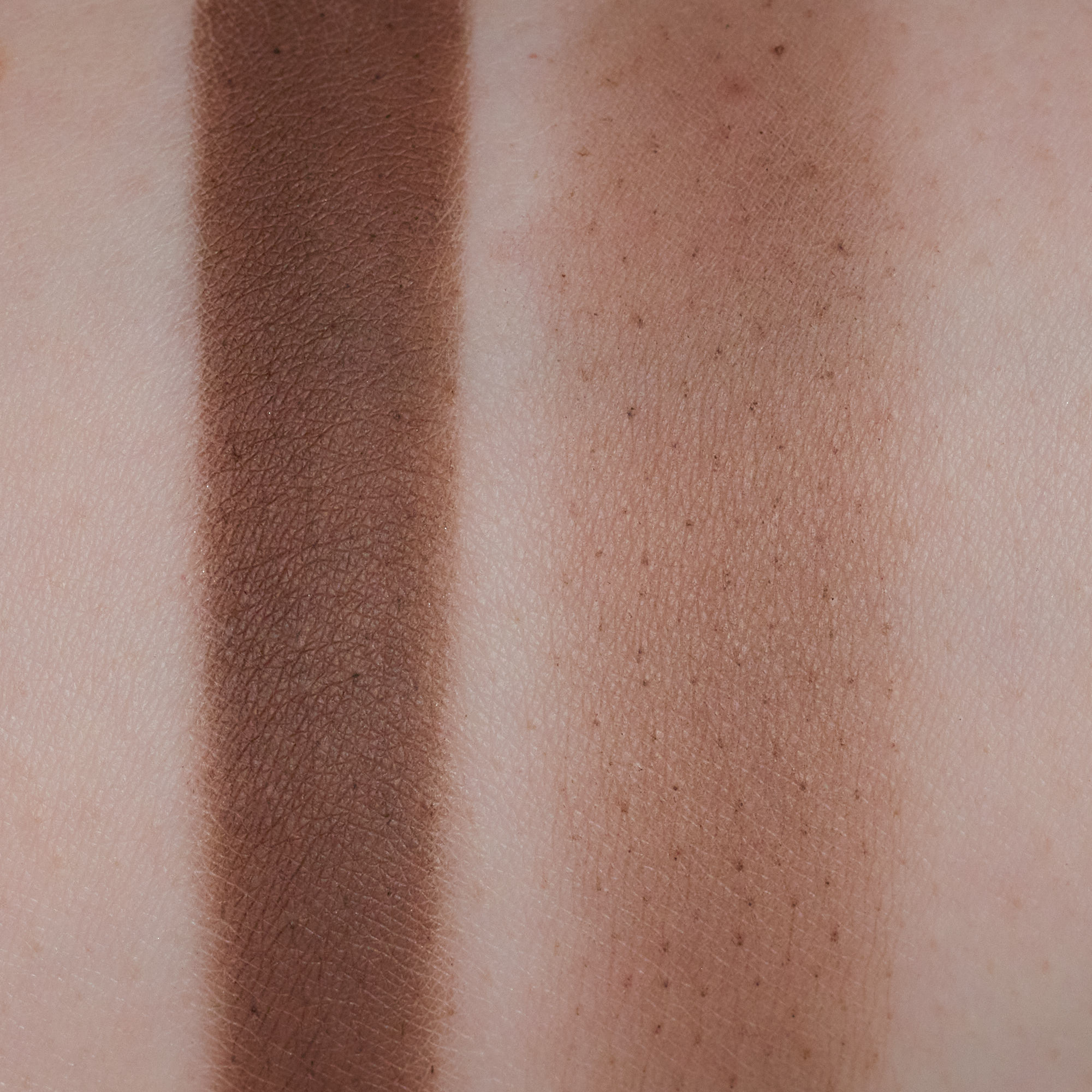
Flax is a medium-deep neutral brown. This shade and the other deep one, Willow, are where the pigmentation difference is really noticeable compared to older Natasha Denona palettes.
Fushi

Fushi is a light yellowy orange. This is the second creamy powder shade but it applies a bit differently than Calathea. This one feels (and smells) waxier and it builds up much more quickly. The blend is just as smooth along the edges though.
Makia


Makia is a sparkly metallic similar in finish to Plantasia. It has sheer but deep grey base color with a lot of golden olive sparkles. The lighting in the photos makes it looks like a shifty duo chrome but it isn’t. The second photo is just darker. This one looks like the same color at all angles.
Ixia

Ixia is a medium-deep orange. Buildable and blendable. Has good color payoff but doesn’t immediately go on the lid the way it looks in the pan, which I like. Easy to work with.
Willow

Willow is a deep bluish green. This is the one shade I wish was a bit more like the older, more intense mattes. It shows up fine but it is quite dark and the color doesn’t go on as evenly as I would like. I have to apply several layers for very even-looking color.