


Danessa Myricks Lightwork 4 is a limited edition, 14-pan palette containing several formulas of high impact color that can be used on the face and eyes. Formulas include:
- Velvet Chromes: These are smooth metallic shades with high shine and fine, uniform shimmer particles and an ultra buttery feel. There are 8 of them and they are all in the smaller pans.
- Glass Metallics: Two of the smaller pans (Divinity and Angels) are this formula. They have larger sparkle particles and a clear base. They go on more dispersed and with less opacity than the Velvet Chromes but can be built up to nearly the same coverage if desired.
- Pressed Chrome Flakes: These include Heaven and Paradise in the center of the palette. They have a somewhat waxy, squishy feel to them. The pigment comes off in scattered flakes of varying sizes and doesn’t have much of a base color. It is easier to pick them up with the warmth of a fingertip but a brush can be used with some time and patience.
- Aqua Chromes: Intuition and Aura in the larger pans are this formula. These are kind of like water color paints. To use them, you must first add a few drops of water to the pan and swirl with a brush to develop a paste-like consistency. Simply dipping a brush in some water before going into the pan works too. From the little bit that I’ve played with this formula, I haven’t been able to get as much color payoff as easily from them as with the Velvet Chromes unless I allow them to dry and add more layers.
Most of the shades have some sort of color shift to them, some more obvious than others. The Velvet Chromes have the most intense and obvious shift. All of the shades in the larger pans have a more subtle shift, and the two Glass Metallics (Divinity and Angels) don’t shift at all.
Trance


Trance (Velvet Chrome) is a royal blue when seen from straight-on and shifts to purple and then red-violet as the angle of the light becomes more extreme. This one has one of the less obvious shifts in real life. The depth of the red-violet makes it more shadowy and just generally harder to see. It has a sheer, deep grey base color that isn’t too obvious against the color of the shimmer.
Nirvana


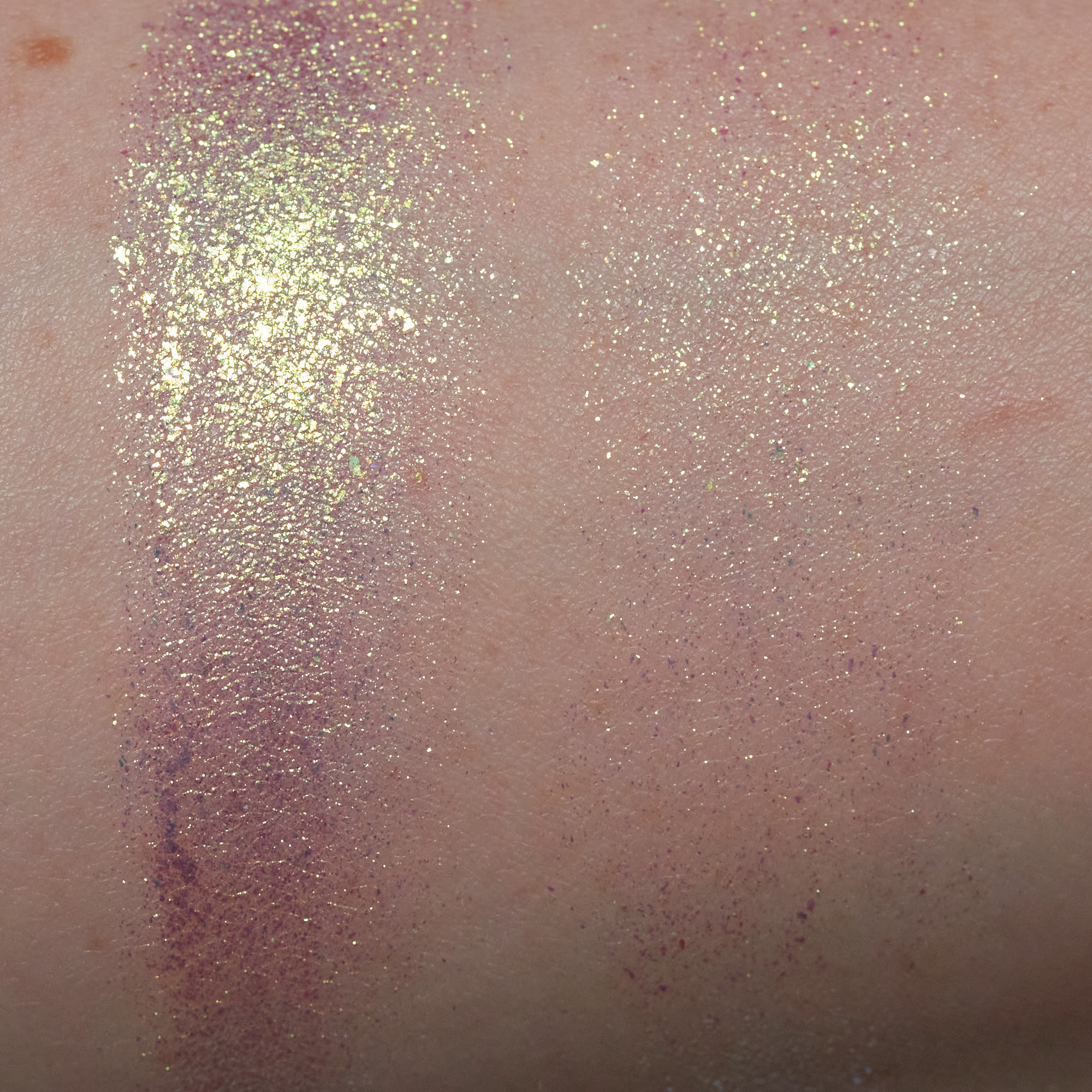
Nirvana (Velvet Chrome) goes from reddish bronze to golden yellow to nearly an olive green. The reddish bronze is the easiest to see in the mirror and in photos but the golden shift is pretty obvious in the right lighting. The base color is a sheer deep grey just like Trance and is a little bit more obvious against the shimmer but not distracting.
Divinity


Divinity (Glass Metallic) is a bright yellow gold with larger, chunkier sparkles and a clear base. A swipe of a finger across the pan will give off a heavily sparkling finish that isn’t opaque so whatever color is underneath will show through. It can easily be built up to have more solid coverage.
Sixth Sense


Sixth Sense (Velvet Chrome) has a lighter, beetle green shine from straight on and shifts to blue-green, to periwinkle, to violet in extreme side lighting. It has a subtle, sheer, warm brown base color
Out of Body


Out of Body (Velvet Chrome) starts from a true vibrant green and fades down the spectrum to teal and finally a deeper violet. Green and blue-green are most obvious at most angles with this shade.
Intuition


Intuition (Aqua Chrome) is a warm greenish-blue and shifts subtly to a light periwinkle and finally to lavender. The way I swatched this, it didn’t have as much opacity as the Velvet Chrome shades. When mixing this with water in the pan, if there is too much water, it will thin out the color so it will look more transparent. The more paste-like and less water there is mixed in with the pigment, the more opaque it will look. You can allow it to dry and add another layer as well.
I find this and the other Aqua Chrome in this palette to not have very obvious changes in color in real life. It could be that its mainly blue-to-purple and to maybe my eyes are not as sensitive to those color changes as something like a purple-to-green or orange-to-green.
Heaven

Heaven (Pressed Chrome Flake) sparkles light yellowish green, then goes to an intense almost neon green, and fades into a pale blue when seen at an angle. The yellowish green and bright green are what I see most easily in the mirror and in photos. This sticks well to the eye and doesn’t move once it is placed but the waxy texture causes powder shadows underneath to crease. It is probably best used away from the crease, like maybe on the brow bone, inner corner, or lower lashline.
Paradise


Paradise (Pressed Chrome Flake) starts off as a deep purple, flows to a reddish plum, then a bronzey green and stops at a true bight green when seen from a sideways angle. This one has a much more obvious color shift than the other one of the same formula. On the eye, I see purple most, ranging from a cooler, bluer purple to a warmer, redder purple the most. Because this formula is generally sheerer, it isn’t as easy to see the shift all the way to green on the eye as it is with something that gives off more of a solid layer of color.
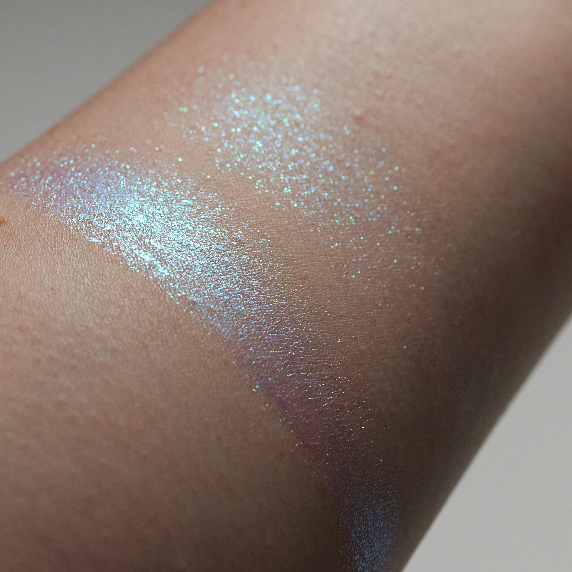
Aura


Aura (Aqua Chrome) is a cooler tone blue that fades slightly to a subtle lavender at an angle. This one is similar to Intuition but cooler overall and has an even less noticeable shift in color.
Zen


Zen (Velvet Chrome) very briefly looks orange, then goes to a greenish bronze and progressively becomes a cooler toned green as I see it more and more from the side. At the widest possible angle I can see the tiniest hint of blue but it is very difficult to catch. A range of bronze to warm green is easiest to see with this shade.
Angels


Angels (Glass Metallic) is a sparkling white shimmer with larger particles than the Velvet Chrome shades. The sparkles are smaller and less chunky than the ones in the other Glass Metallic though. This shade reminds me of the Fenty Diamond Bomb Highlighter but with more opacity.
Trippy


Trippy (Velvet Chrome) looks purple from straight on, becomes more reddish orange in the middle, and finally green. This shift is this one is much easier for me to see than with a lot of the other shades.
Escapism


Escapism (Velvet Chrome) is yellowish green in direct light, then looks like a grass green as I begin to turn to the side, and gradually fades down the spectrum to an ocean blue.
Awakening


Awakening (Velvet Chrome) begins as a peacock blue-green, goes to purple, and ends at a reddish plum at the most extreme angle.