Product Details
The ColourPop Rock Candy Palette is one of several 30 pan neutral palettes ColourPop offers. Of the ones they currently have, this one seems to be the most well rounded in terms of color and texture selection. There are 13 mattes, 11 shimmers, 3 mattes with sparkle, and 3 pressed glitters. For a neutral palette it has several tones (besides the usual brown). There are purple and rosy tones, oranges, yellow toned browns, greys, blacks, and for the more shiny shades there are silvers, coppers, and golds. This palette is just like their other large ones – same size, magnetic pans, and cardboard packaging. It is available on their website for $34.
Swatches
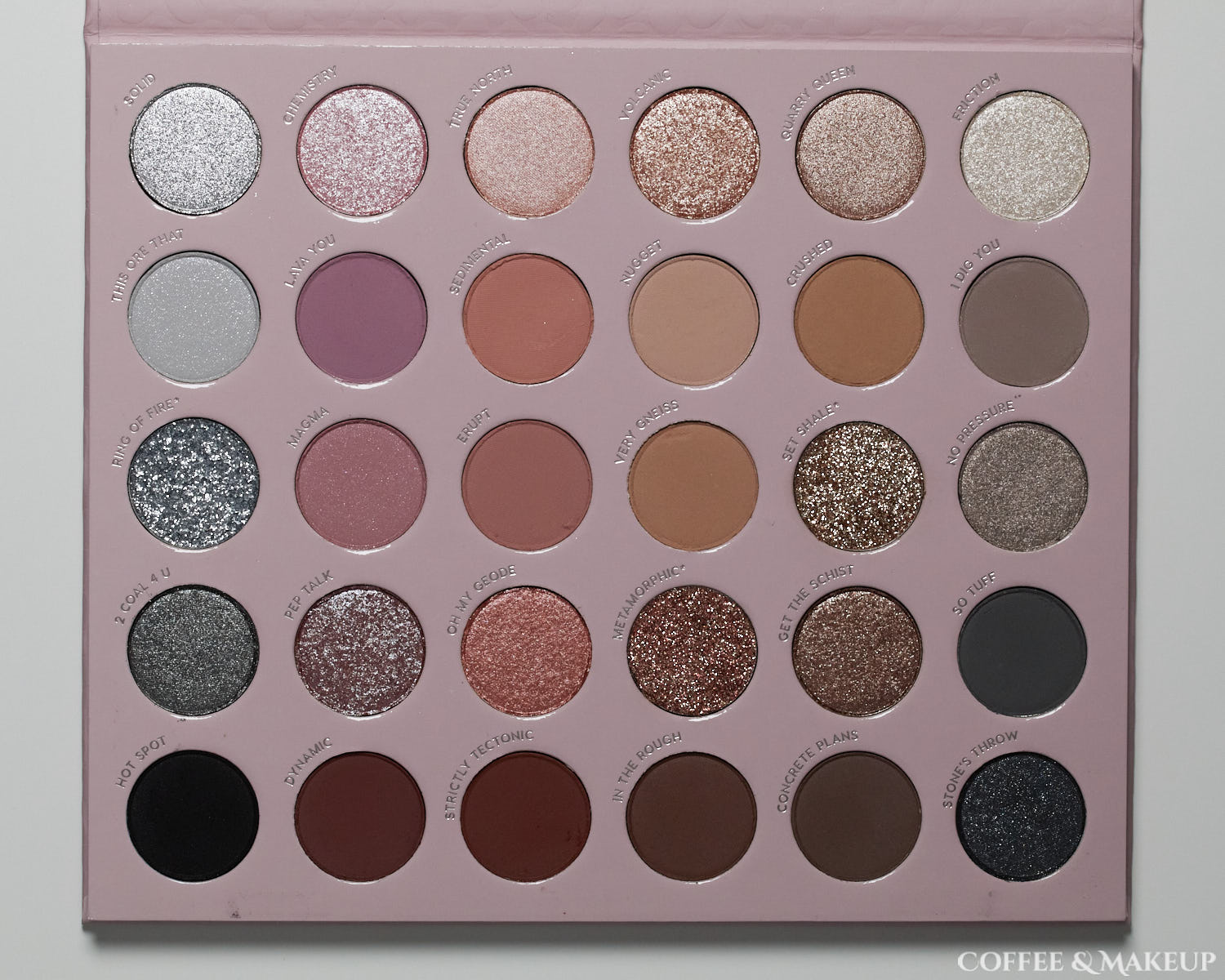
Here is an overview of all the shades swatched. To see more detailed, closer up swatches, see this post.

- Solid – Metallic bright silver, all small particles. Excellent color payoff.
- Chemistry – Pale pink shimmer with a mixture of small and large particles.
- True North – Light peachy beige, no large sparkles. Sheerest shade in the row.
- Volcanic – Metallic light copper with larger sparkles. Good color payoff.
- Quarry Queen – Smooth light bronze shimmer, all small particles.
- Friction – Pale golden white shimmer with larger sparkles.

- This Ore That – Matte pale grey with silver sparkles.
- Lava You – Dusty lavender.
- Sedimental – Medium orangey brown.
- Nugget – Neutral light beige.
- Crushed – Medium yellow toned brown.
- I Dig You – Medium taupey grey. Has a slight warmth to it.

- Ring of Fire – Bright silver self-adhering pressed glitter. Fairly small particles for a glitter.
- Magma – Matte dusty rose with larger sparkles.
- Erupt – Warm rosy brown.
- Very Gneiss – Medium yellow toned brown.
- Set Shale – Golden self-adhering pressed glitter. Similar particle size as Ring of Fire.
- No Pressure – Light taupe shimmer with larger sparkles.

- 2 Coal 4 U – Deep grey shimmer with larger sparkles.
- Pep Talk – Warm reddish base with a blueish sheen and lots of larger multicolored sparkles.
- Oh My Geode – Reddish copper shimmer with larger sparkles.
- Metamorphic – Silver, gold, and pink self-adhering pressed glitter. Similar particle size as the other two glitters.
- Get The Schist – Cooler toned bronze shimmer with large silver sparkles.
- So Tuff – Deep neutral grey. Doesn’t really lean warm or cool and doesn’t have a blue tinge.

- Hot Spot – Matte black. Swatches evenly but does require some building for full coverage. Has a bit of a drag to it that the other mattes don’t have.
- Dynamic – Deep reddish brown.
- Strictly Tectonic – Ever so slightly lighter than Dynamic and a bit more orange than red.
- In The Rough – Deep neutral brown.
- Concrete Plans – Slightly cooler toned deep neutral brown.
- Stone’s Throw – Matte black base with lots of multicolored sparkles. The matte base feels different in this shade than Hot Spot and has more color payoff more quickly.
What I Think About It
So I’ve used this palette for a couple weeks and I’ve filmed four looks with it. I’ve used every shade, some more than others, and I feel like I know it well enough to share my thoughts.
The quick version: I like it but I don’t love it.
I like it because it has a lot of useful shades and textures all in one place and for a reasonable price. For someone that doesn’t have many neutrals already, this can fill that need. Lots of textures help make an otherwise (sort of) boring palette more interesting. I also like that the pans are magnetic and I already have other ColourPop palettes with the same size pans that I can use to customize it for myself.
The things that I don’t love are fallout from some of the shimmers with larger sparkles, some redundant shades, and the quality of the mattes. The mattes feel luxurious to the touch, have good color payoff and blend easily but they do something I don’t have an issue with usually. Some of them sometimes darken on the skin on areas with more moisture (the line of my crease, mostly) or where they are blended/touched too much or layered a lot. This makes them somewhat unpredictable. When I have issues with them, it’s usually not a major or very obvious problem, but if you are a stickler for quality, it might bother you.
The shades that I find most unique or that add value to my collection are Solid and This Ore That. The whole left row in general stands out for me.
Shades that are too similar are:
- Crushed and Very Gneiss
- Dynamic and Strictly Tectonic
- In the Rough and Concrete Plans
- Sedimental and Erupt look more similar in the pan than they do in swatches
Wear time is average for me, meaning it will last most of the day over primer before creasing but I would not count on these shadows if I was really needing something long wearing. Without primer, I see fading in the crease by lunchtime and by my second break at work, the shadows are very noticeably gathered in the crease. With primer, they wear pretty strongly till my second break and by then I can see them starting to crease. The way some of the mattes applied and darkened in the crease almost immediately makes me feel that they aren’t the longest wearing matte formula and are more sensitive to moisture in the skin than others I have.
Looks

Look #1:
- Nugget – Transition
- I Dig You – Outer crease
- So Tuff – Outer lower lashline, outer corner
- Get the Schist – All over lid
- True North – Inner corner
- Hot Spot – Used as eyeliner
The lid shade I have on here is an example of a shimmer with larger sparkles. They do show up and it’s really up to you to decide whether that is something you like and find worth cleaning up the fallout for. I personally don’t find shades like this to be unique enough to warrant the extra work and would prefer that all the particles just be small.

Look #2:
- Sedimental – Transition (both on the upper and lower part of the eye)
- So Tuff – Outer crease
- Stone’s Throw – Most of the lid
- Oh My Geode – Inner lid/crease
- Metamorphic – Center part of crease/transition area
- Hot Spot – Upper and lower lashline
- Dynamic – Lower lashline
- Volcanic – Inner corner

Look #3:
- This Ore That – All over lid
- Lava You – Outer transition area
- Solid – Outer crease-ish area, between two previous shades
- Hot Spot – Used as eyeliner
- 2 Coal 4 U – Outer lower lashline
- Ring of Fire – Below previous shade
- Pep Talk – Inner corner (applied with damp brush)
I used two of the shades that I find more unique and that add more value to my collection here. Solid is the metallic silver I have on the outer crease area. Silver isn’t terribly unique in general but this one performs so beautifully that it stands out as possibly the best silver I have. I applied it this way using nothing but a dry eyeliner brush. The other unique shade in this look is This Ore That. I complain about sparkle fallout (probably to an annoying degree) but this is a case where I find it worth the cleanup, which isn’t all that bad for this shade btw.

Look #4:
- Nugget – Transition (barely shows)
- Lava You – Inner crease
- Sedimental – Outer crease
- I Dig You – Inner lid
- Strictly Tectonic – Outer lid
- Erupt – Inner lower lashline
- Crushed – Outer lower lashline
This look was an attempt to see how well the different tones in the matte shades could show up against one another. The palette as a whole is pretty muted but I think the different tones still show up well enough.
Comparisons
Some people have pointed out a couple of palettes they were curious how this compared to, like the Huda Beauty Rose Quartz Palette (some similar shades), and the Tati Beauty Textured Neutrals Palette (for the wide variety of textures).

I wore this side by with the Huda palette and I was able to get a look that was similar enough to wear without feeling the difference was obvious enough to other people. So there is a little bit of overlap but I think they are pretty different overall. I like the quality of the Huda palette better and the shades seem more thoughtfully chosen. I don’t feel there is anything redundant in that palette. It wears longer too. The ColourPop palette does offer things you can’t get in the Huda palette though, like the glitter, some of the more brown toned neutrals, a different selection of transition shades, and a pretty good black.

Comparing this to the Tati Beauty palette, the glitters in both have smaller particles than other pressed glitters I’ve tried from ColourPop. There is one glitter that looks like a true dupe (Set Shale and Soothe). The color selection is very different though, again, with some overlap but less than with Huda’s palette. The black in Tati’s palette is a VERY good one, I like it better than the ColourPop one, but the ColourPop one is quite good too.