Disclaimer: This post contains affiliate links, which means I make a small commission when you make purchases through them.


I picked up the Too Faced Italian Spritz Palette when it came out and have been giving it a go for the past couple weeks. Here are swatches of all of the shades along with descriptions and some of my thoughts on how they perform.
The Too Faced Italian Spritz Palette combines colorful, summery shades and warm neutrals in their classic tin packaging. There are 18 shades in here with a good balance of mattes and shimmers. Roughly half of the shades are colorful while the other half are more neutral. It is available for $54 from Ulta and Too Faced.
The mattes are generally fairly consistent in quality except for a couple that needed some extra help from a primer in order to prevent fading and stay adhered to the lid for a reasonable amount of time. They don’t feel particularly dry and they are also not exceptionally silky. They just feel like decent standard matte eyeshadows with satisfying, smooth color payoff that sit smoothly on the lid.
The shimmers come a variety of formulas. Many of them have a thicker, waxy feel to the touch that swatch well with fingers but don’t pick up as easily on a brush. A few have a comparably drier but still silky feel to them. All of them have a mixture of fine shimmer and large sparkle and fallout from them was generally far less than I was expecting, which was a nice surprise.
Holy Cannoli

Holy Cannoli is a light matte peach. I have used this one as a lid shade and along the lower lashline and found that it has enough brightness and depth to show up easily against my skin tone. It had good, quick color payoff, adhered well to the skin and didn’t brush away too easily.
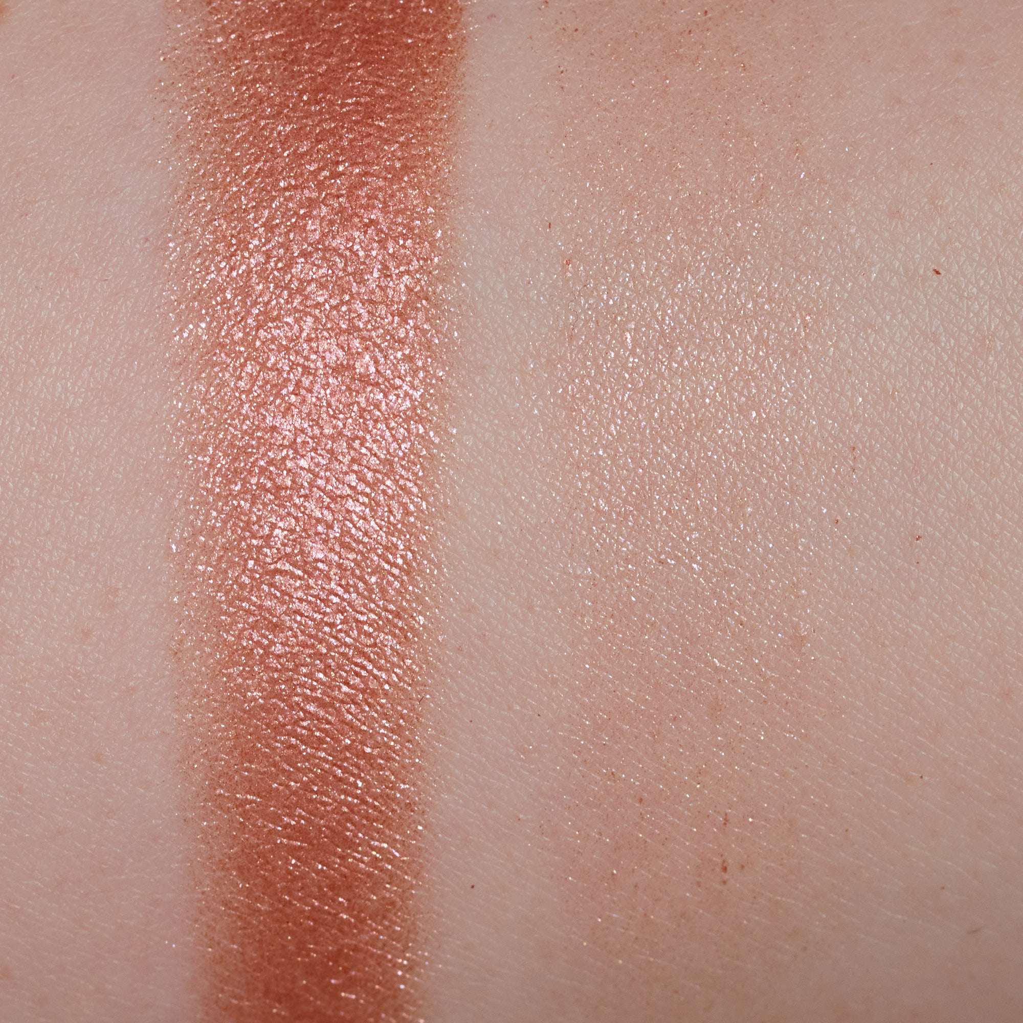
Ciao, Bellini!

Ciao, Bellini! is a mixture of fine peachy shimmer and large gold sparkles. This is one of the thicker-feeling shimmers. It swatches more heavily than it goes on to the lid and is much easier to apply with fingers than with brushes.
When In Rome…

When In Rome… is very vibrant hot pink. It didn’t stain my lids and I was able to use it in a sheered out way or build it up to near full opacity. It applied and blended out smoothly.
Take Me To Church
Take Me To Church is a lot like Ciao, Bellini! two swatches ago. Same type of formula and applies very similarly, just with a more of a pinky tint.
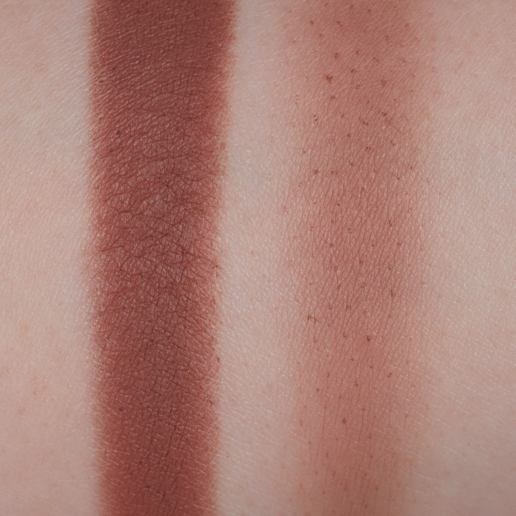
Feelin’ Saucy

Feelin’ Saucy is a deeper matte orange. This was one of the best quality mattes with excellent color payoff but was also super easy to blend out.
Lake Como

Lake Como is one of the silkier-feeling shimmers. It picks up more easily on a brush than the thicker shimmers do but still only gives me a sheer wash of color (similar to the way the lighter swatch looks). In order to get it to look more like the heavy swatch on the eye, I need to use a dampened brush or apply it over a sticky primer to help it pop more.
Toasted In Tuscany

Toasted In Tuscany is a light warm brown with neutral undertones. This is the most natural-looking shade on me to use as a transition and doesn’t lean too yellow/orange and not too pink. Adheres and builds up well, blends and sheers out well too.
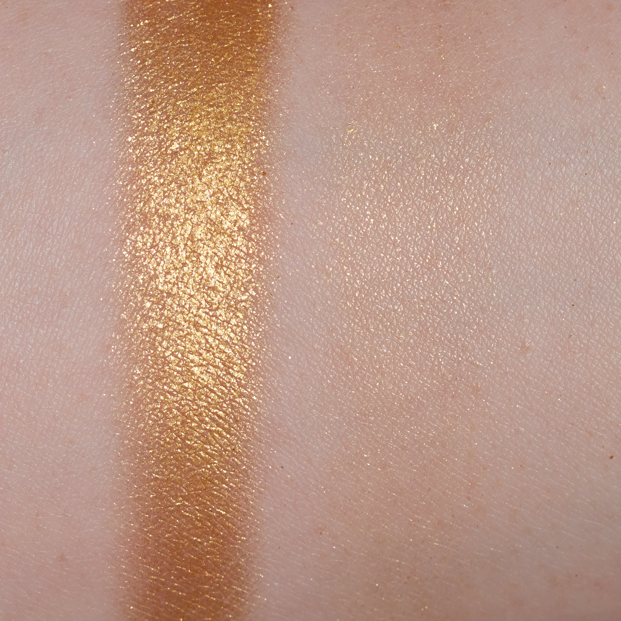
Cin Cin!

Cin Cin! is a metallic medium bronze. It is one of the thicker shimmers like Ciao, Bellini! and Take Me To Church, but unlike those, it has more intense color payoff so I am able to apply it with a brush and still have it show up well.
Spritz & Glitz

Spritz & Glitz has a base of sheer fine lavender shimmer and along with plenty of larger blue sparkle. It is the same type of formula as Lake Como, with a silkier feel to it that picks up more easily on a brush. Applying this with a dry brush, I get something that resembles the lighter swatch, and using it with a damp brush or sticky primer gives me more bold color payoff, like the heavier swatch.
Spaghett About It

Spaghett About It is a light pinky/peachy brown that I can use in a similar way as Toasted In Tuscany. This one looks less natural and more rosy on me but performs just as well as that one.
Grappa Don’t Preach
Grappa Don’t Preach was one of the most difficult to use shimmers. It is one of the thicker feeling shimmers and using a dry brush required MANY layers to get it look anywhere near the heavier swatch. Using a damp brush really helped to get this one to build up more quickly.
Espresso Yourself
Espresso Yourself was one of my least favorite mattes. It has good color payoff and looks decent when first applied but quickly fades in the crease if not used over an eyeshadow primer. This is the type of matte that grabs onto the skin and isn’t the easiest to move and blend around the edges once it is placed. I got better results using a flat shader to apply it and blend upward as there was gradually less color on the brush. It was not easy to apply initially with a fluffy brush.
Lake & Bake

Lake & Bake is a warmer ocean blue with somewhat of a sheer blue base and a whole lot of blue shimmer and sparkle. This is similar in texture to the shade Cin Cin!, where it feels thicker to the touch but has enough pigmentation to be able to apply it with a dry brush.
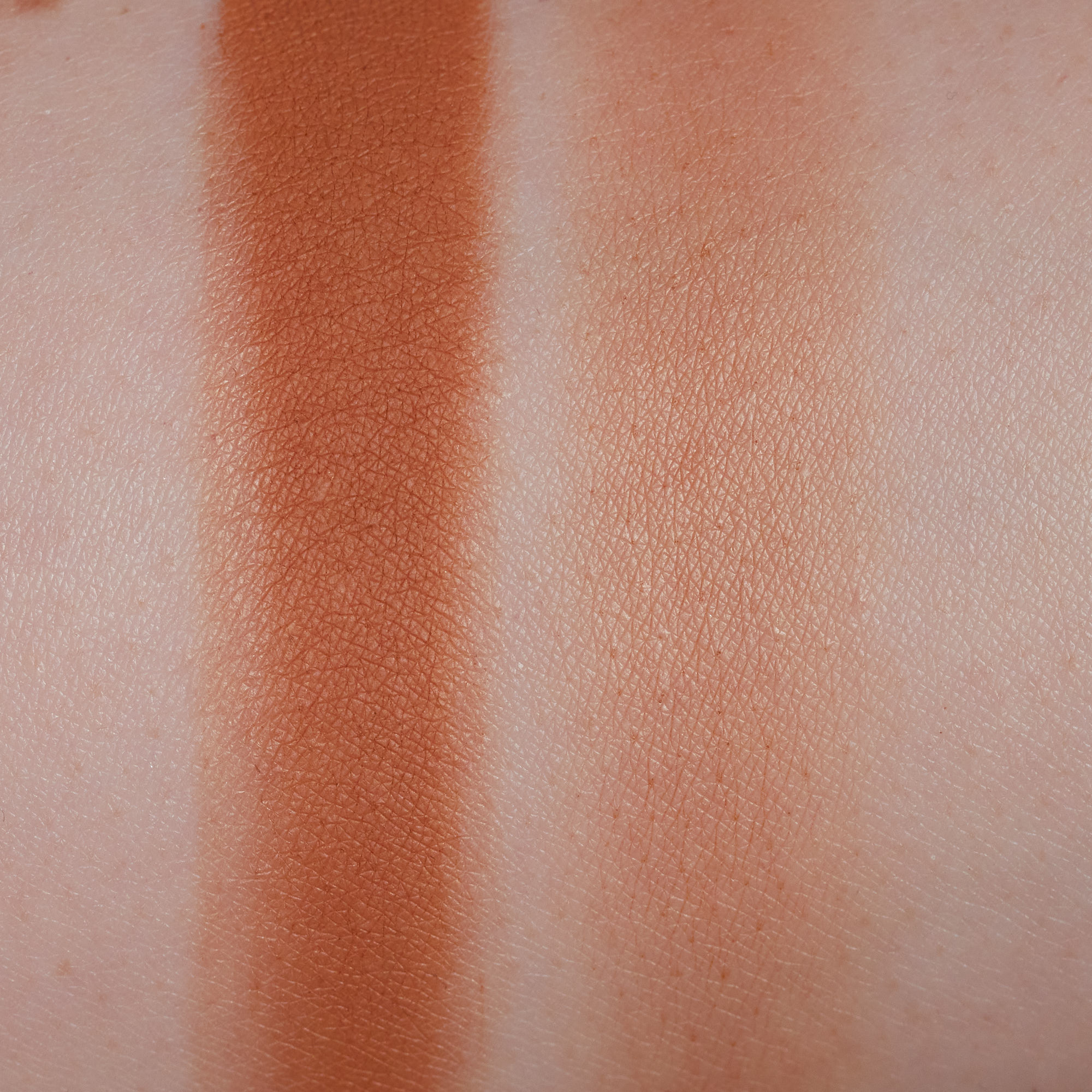
Capri Fun

Capri Fun is a very warm, almost orange-leaning yellow. It is another one of the better mattes in the palette. Excellent color payoff that can easily go from sheer to nearly opaque with smooth blending.
Mamma Mia!

Mamma Mia! is another one of my least favorite shades. It is similar in quality and performance to Espresso Yourself. It applies fine initially with good color payoff but requires a good primer to stay in place. This one is a bit more easily dusted away if I blend over it too much.
Como After Dark

Como After Dark is a deep grey shimmer with lots of silver sparkle. Shades like this usually scare and disappoint me but I think this one is really well done. The formula of this is not like the thicker, waxy shades, and is closer to the two silkier feeling shimmers but I am able to use a dry brush to pick up and apply this without any issues. Good color payoff with a surprisingly small amount of fallout for how sparkly it is. Impressed with this one.
Impasta-ble
Impasta-ble is the last medium-depth transition shade with a very obvious honey-yellow tone. It was just as easy to use as the other midtone neutrals in the palette.
Gelat-ohh!

Gelat-ohh! is a reliable matte highlight with neutral undertones. This one is light enough on me to actually be a highlight. I often use shades like this to add coverage to the inner corner and brow bone and I find color payoff is very good for that purpose. It sits smoothly on the skin without look heavy or dry.