


The Natasha Denona Pastel Palette contains 15 shades of (mostly) pastel eyeshadows in various formulas and finishes. 8 of them are matte (with half being creamy powders and the other half being true powders) and 7 of them are shimmers. Some shimmers are nothing but fine particles and some have larger sparkles mixed in. This is one of their midi-sized palettes which has smaller pan sizes and retails for $65.
Swatches


- Tulle – Creamy powder. This one has a very subtle sheen that the other creamy powders don’t have but it essentially looks matte on the eye. This is the most pigmented of all the creamy powders and looks slightly drier on the lid than some of the others.
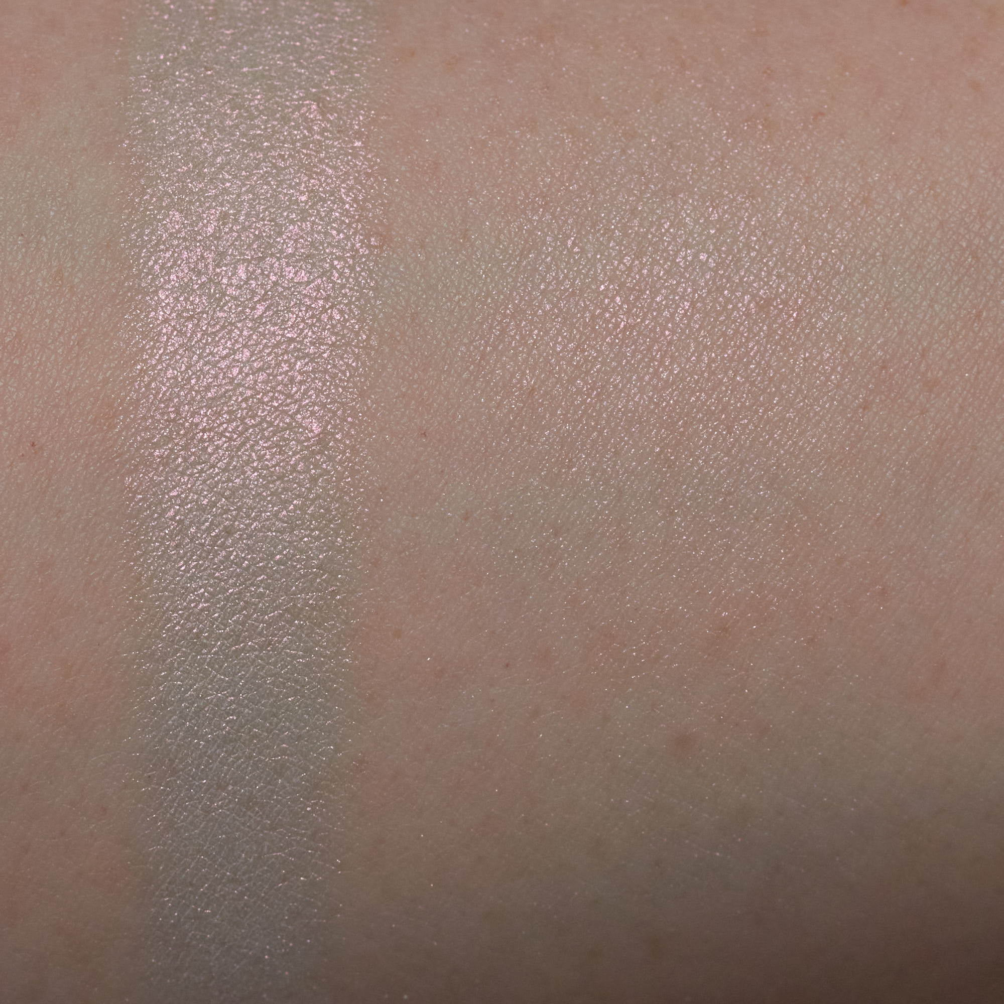
- Illusion – All fine shimmer, no large sparkles. This is a sheer pale pink shimmer with a clear base. When swatched heavily, it has a bit of a grayish cast behind the pink shimmer but I don’t notice this the way I use it on the eye.
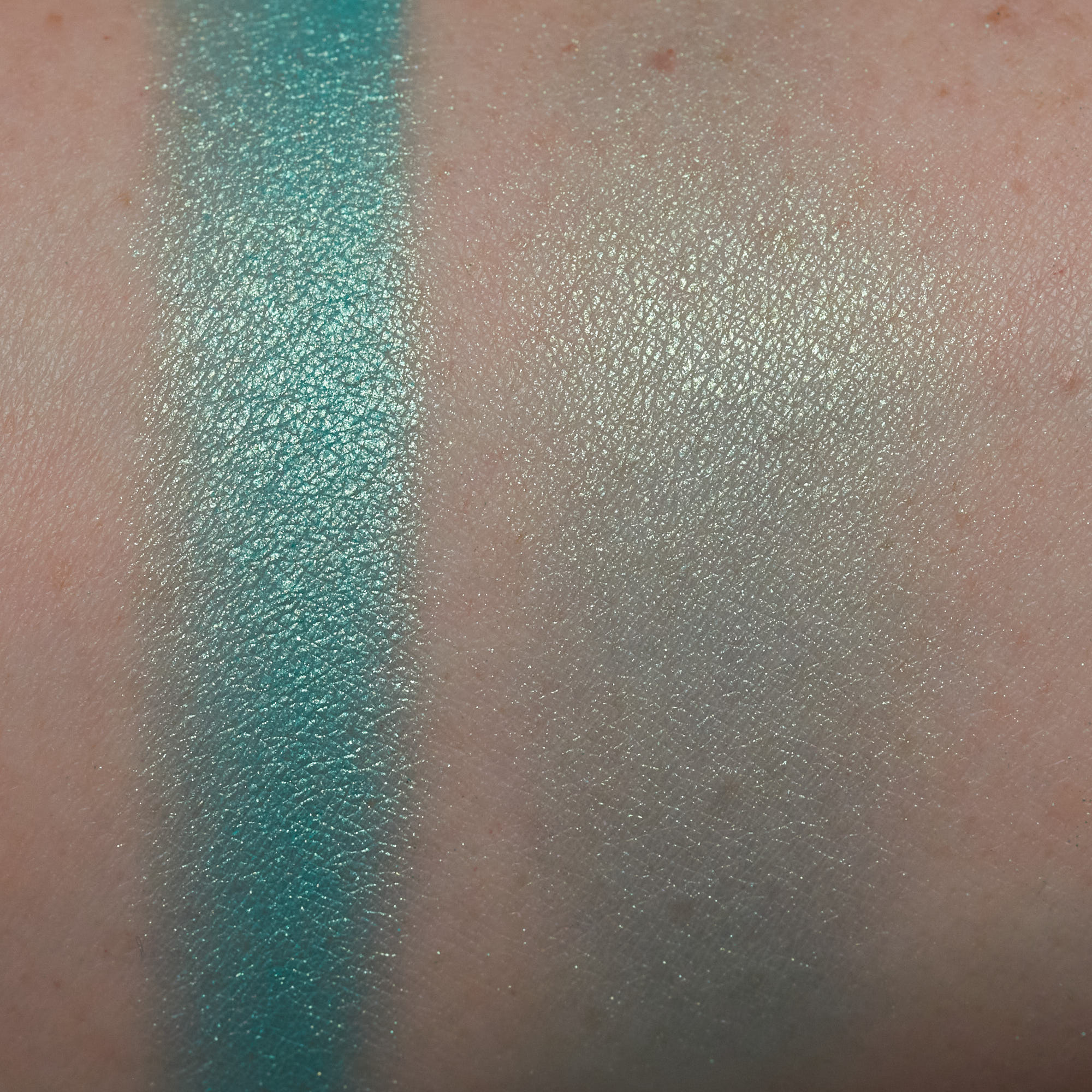
- Mint Frost – Mixture of fine shimmer and large sparkle. Similar to Adriatic but this one is more of a dulled teal shade and that one is brighter. That one also has a different texture, being all fine shimmer.
- Bora – Creamy powder. This shade is sheer and requires lots of building. I get the most color payoff when using a small dense brush like a pencil brush or a smudge brush. Blends out super easily and smoothly and does not look dry at all on the lid. Fades in the crease during application. Wear time seems inconsistent with this shade. Some looks lasted only a few hours and others lasted all day 🤷♀️
- Dainty – Mixture of fine shimmer and large sparkle. Reasonable amount of fallout when applied with a brush but a LOT of fallout if applied with my finger.


- Brisk – Powder matte. This shade has good color payoff but is a bit dry and that can make it not adhere the best. It went on more evenly and looked punchier over a primer.
- Adriatic – All fine shimmer. This type of texture usually has less fallout, or even none, but I got some noticeable fallout with this one. It’s a teensy bit crumbly and I think that may be why. Good color payoff and adhered easily.
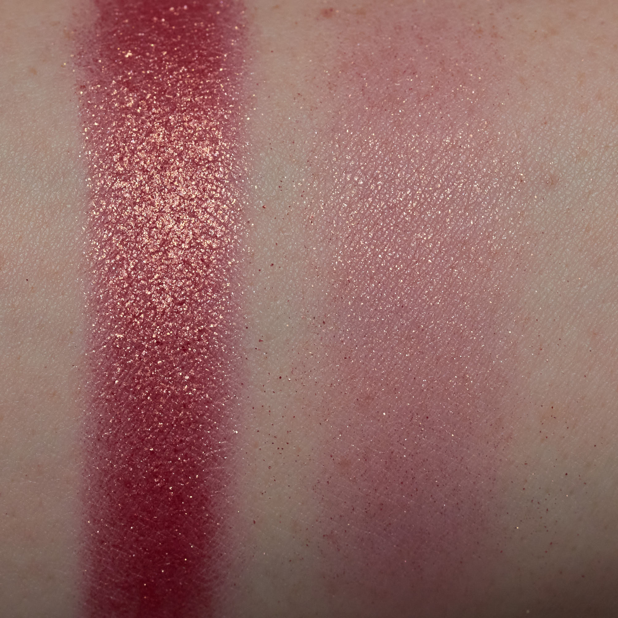
- Starlet – The coral base of this seems to be matte with a bunch of large golden sparkle.
- Bellini – Powder matte. Good color payoff, maybe a hair better than Brisk, which is the same type of formula. Shades like this sometimes don’t show up well on me, but the one had plenty of pigmentation.
- Bubble – Creamy powder. This is the sheerest of all the cream shades but I can build it up to what you see here. Just needs many layers.


- Limoncello – Mixture of fine yellow shimmer and larger blue sparkle. There is more fine shimmer in this than sparkle and the blue shows up only sparingly.
- Duet – Pinky base with fine blue shimmer. This is a sheer shade and the blue sheen shows up much better if I apply this over a deep shade. The pink is even pretty sheer though it looks heavy in the swatch.
- Airy – Powder matte. Similar to Bubble but “warmer”.
- Zest – Creamy powder. This looks more green toned in the pan but on the eye it looks more yellow to me. It is slightly dry looking on the skin. Good color payoff.
- Feather – Powder matte. This looks more like a light pink in the pan but comes off more lavender on the eye. Good color payoff and not all that far off in depth compared to Bora once both are on the eye together.
Formula Overview
There are four creamy powders in the palette: Tulle, Zest, Bora, and Bubble. They seemed like the longest lasting of all the finishes and can be used as bases sort of on their own. They aren’t full on cream shadows and don’t have a tacky or sticky feel at all, mainly just a slightly more emollient version of a powder shadow. They generally feel dry to the touch but they don’t have that dusty, kickup-y quality that true powders have. With a primer, they last longer and are much slower to crease completely (takes several hours). I’ll start to notice creasing around 8 hours but it will still look decent several hours after that. Without primer, I they last around 5 hours. These take longer to use than all the other formulas in the palette. They require lots of building (especially Bora and Bubble) so they aren’t the best choice if you are in a rush but they are super easy to blend. Bora and Bubble are very flattering on the lids, good for more mature/textured skin. Tulle and Zest are a little more dry looking.
The powder mattes apply noticeably better over primer with more color payoff and more even adherance. They are kind of dry and when I apply them over bare lids, I’ll sometimes get areas of balding where the shadow just wont stick and this ends up giving a sort of patchy appearance. Compared to other pastels I’ve tried, pigmentation is generally good though with a nice texture that isn’t chalky or difficult to blend.
There are 7 shimmers. 4 of them are a mixture of sparkle and shimmer and 3 are just fine shimmer with a smoother finish. They all pick up and adhere easily. To the touch, they have a slightly thicker feel to them and they require some layering to build them up. The ones with larger sparkles are more shiny, reflect light more and have a reasonable amount of fallout. The ones that just have fine shimmer in them have a bit of a softer, more subdued reflection. Illusion and Duet are the sheerest and Adriatic and Starlet are the most opaque.
Shade Selection
I don’t love the shade selection in this palette as a whole but I do like many of the shades individually. After doing like 12 looks or so, I’ve either gone for very straightforward color combinations or used way too many shades together. I think I may just be sick and tired of pastels LOL.
Some of the shades are very similar to each other:
- Bora and Feather, once applied to the lid. And Tulle really isn’t that far off from these either.
- Bubble and Airy (subtle difference but still lol…)
- Mint Frost and Adriatic (different finishes but very similar hue)
Something to know is that some of the shades are a bit deceiving, not looking as I’d expect on the eye based on how they appear in the pans. These are Bora, Dainty, Duet, and Zest. Both Bora and Dainty are lighter than expected, Duet is much more blue than pink, and Zest is more yellow than neon green to me.
Worth Buying / Do I Recommend It?
I can’t say yes to this. If I were buying this again I’d be doing so for certain shades. Mint Frost, Dainty, Starlet are probably my top picks in this palette. Bubble is beautiful for the color that it is but I think I have some similar shades in a true powder formula that offer more color payoff than this one. Zest seems unique in the pan but it doesn’t seem so once on the eye. That’s not enough reason to spend $65 for the rest of the palette.
It’s not that I think the quality is bad, just that it’s meh, okay, average. If you are looking at pastels in general, I don’t see why this should come in above others unless you are looking for something very specific that this palette has that a competing product doesn’t.
Looks


Look #1:
- Bora – All over lid and blended into crease, part of the lower lashline
- Bubble – Inner crease, outer lower lashline
- Bellini – Transition, inner lower lashline
- Illusion – Inner corner
- Starlet – Center of lid
This was one of the first looks I did so I went for several of the shades that initially intrigued me and ended up with a cross between a sunset and sunrise eye. Both shimmers were applied with brushes and I didn’t get a whole lot of fallout from them. The purple that I used on most of the lid is a cream and that one required lots of building. Even so, the second photo shows that it still looks somewhat sheer in the crease.


Look #2:
- Zest – Crease/transition area (looked a bit dry on the skin)
- Airy – All over lid
- Dainty – Center of lid (applied with finger, lots of fallout, adhered easily though)
- Adriatic – Under inner part of brow
- Feather – Inner corner
- Bellini – Most of lower lashline
- Limoncello – Inner lower lashline (applied with damp brush), brow bone (dry brush)
- Mint Frost – Outer crease
I was still in that excited phase of using a new palette where I want to use ALL the colors so I used a ton of shades in this look. For the most part I was happy with how they all performed but I did get a whole lot of sparkle fallout from all the shimmers I used (4 in total) and I applied the lid shade with my finger on top of that). Here, Zest looks very yellow in the crease compared to how it looks in the pan. In the pan, it looks more green to me.


Look #3:
- Bora – All over lid, crease
- Feather – Transition (more so on inner part of eye), lower lashline
- Dainty – Center of lid (applied with brush, much less fallout this time)
This was meant to be a fast and simple look. It was simple but took me longer than I thought because I had to spend a lot of time building up Bora on the upper lid. The purple on the top lid and the lighter lavender on the lower lashline look fairly close in depth here but in the pans they look much different from each other. Bora is a cream and Feather is a powder. The shimmer used in this look adhered more easily over the creamy shade than it did over a powder in a previous look.


Look #4:
- Tulle – All over lid, crease, lower lashline
- Bora – Outer corner
- Illusion – Inner lid
- Duet – Center of lid
- CPRC Hot Spot – Smudged into lashline
- CPRC 2 Coal 4 U – Winged liner
Another pretty simple and fast look. The main shade used all over the lid is one of the most pigmented of the 4 creams and builds up quickly. Illusion has a pink sheen which is very hard to see against the matte pink background but the blue from Duet shows up a little better on the center of the lid. I used a matte black eyeshadow to darken the lashline and a deep shimmery grey eyeshadow to do the winged liner.


Look #5:
- Brisk – Lid, above crease
- Adriatic – Under the grey on lower lashline
- CPRC So Tuff – Crease
- CPRC 2 Coal 4 U – Lower lashline
- A white liquid liner (Rimmel Colour Precise White Felt Tip Liner) – Outer corner, inner lower lashline near tear duct
This look and the next two were my attempts at using this palette as an accent or pairing palette. I used a matte and shimmery grey from the ColourPop Rock Candy Palette for this one.


Look #6:
- Mint Frost – Center of lid/crease
- Brisk – Lower lashline
- CPRC I Dig You – All over lid and crease
- CPRC So Tuff – Inner lid, outer part of crease
- CPRC Hot Spot – Lashline, used as eyeliner
I paired this again with the ColourPop Rock Candy Palette and went for something more wearable.


Look #7:
- Zest – Above inner crease
- Airy – Above outer crease
- Duet – Center of lid
- Limoncello – Center of lower lashline (applied with damp eyeliner brush)
- CPSVL Topanga Blvd – All over lid/crease
- CPSJ Sapphire – Lower lashline
- CP Swerve Gel Liner – Lower waterline
Third pairing palette look. This time I used the ColourPop So Very Lovely and So Jaded Palettes.


Look #8:
- Bubble – All over lid and inner/outer lower lashline
- Airy – Just a small amount of this above the crease (then stopped and switched to Brisk)
- Brisk – Above inner/outer crease
- Zest – Center part of crease, center of lower lashline
- Limoncello – Center of lid, brow bone, inner corner
- Eyeliner?
Ugh this look. Lol I really don’t like how this came out. Airy is similar enough to Bubble that I would’ve preferred to just have Bubble in the palette. Bubble is cooler (closer to purple) and a bit more unique. Putting the two next to each other makes it really hard to tell where one starts and the other ends. Brisk was much easier to distinguish.


Look #9:
- CPRC Nugget – Transition
- CPRC Crushed – Crease
- Feather – Lower in the crease
- CPRC Dynamic – Lid
- Dainty – Lid (layered over previous shade)
- Zest – Under inner part of brow
- Illusion – Inner corner
- Mint Frost – Outer lower lashline
- Adriatic – Inner lower lashline
- Duet – Brow bone
- Bellini – Transition (applied over CPRC Nugget from ealier)
This look and the next were me just playing with tons of shades and they really had no plan, rhyme or reason to them. On the lower lashline I used both shimmery teals next to each other to see how different they were. The inner corner on this eye is Illusion and in the next look I used a very similar shade from Terra Moons on the inner corner to see how those compared to each other. The Terra Moons shade has a deeper red sheen and just looks warmer overall.
I used a few neutral browns from the ColourPop Rock Candy Palette in this look.


Look #10:
- Terra Moons Red Giant – Inner corner
- Bora – All over lid, blended into crease
- Bubble – Outer crease
- Tulle – Above outer crease
- Bellini – Center of lid
- Limoncello – Inner lid/crease
- Airy – Outer lower lashline
- Brisk – Inner lower lashline
- Starlet – Winged outer corner


Look #11:
- Tulle – All over lid/crease
- Illusion – Applied over top Tulle
- Limoncello – Inner corner, brow bone (dry brush)


Look #12:
- Bellini – All over lid/crease
- Starlet – Center of lid
- Zest – Lower lashline
- CPRC Hot Spot – Smudged against lashes
- CP Swerve Creme Gel Liner
- Matte highlight on the inner corner and brow bone