Disclaimer: This post contains affiliate links, which means I make a small commission when you make purchases through them.
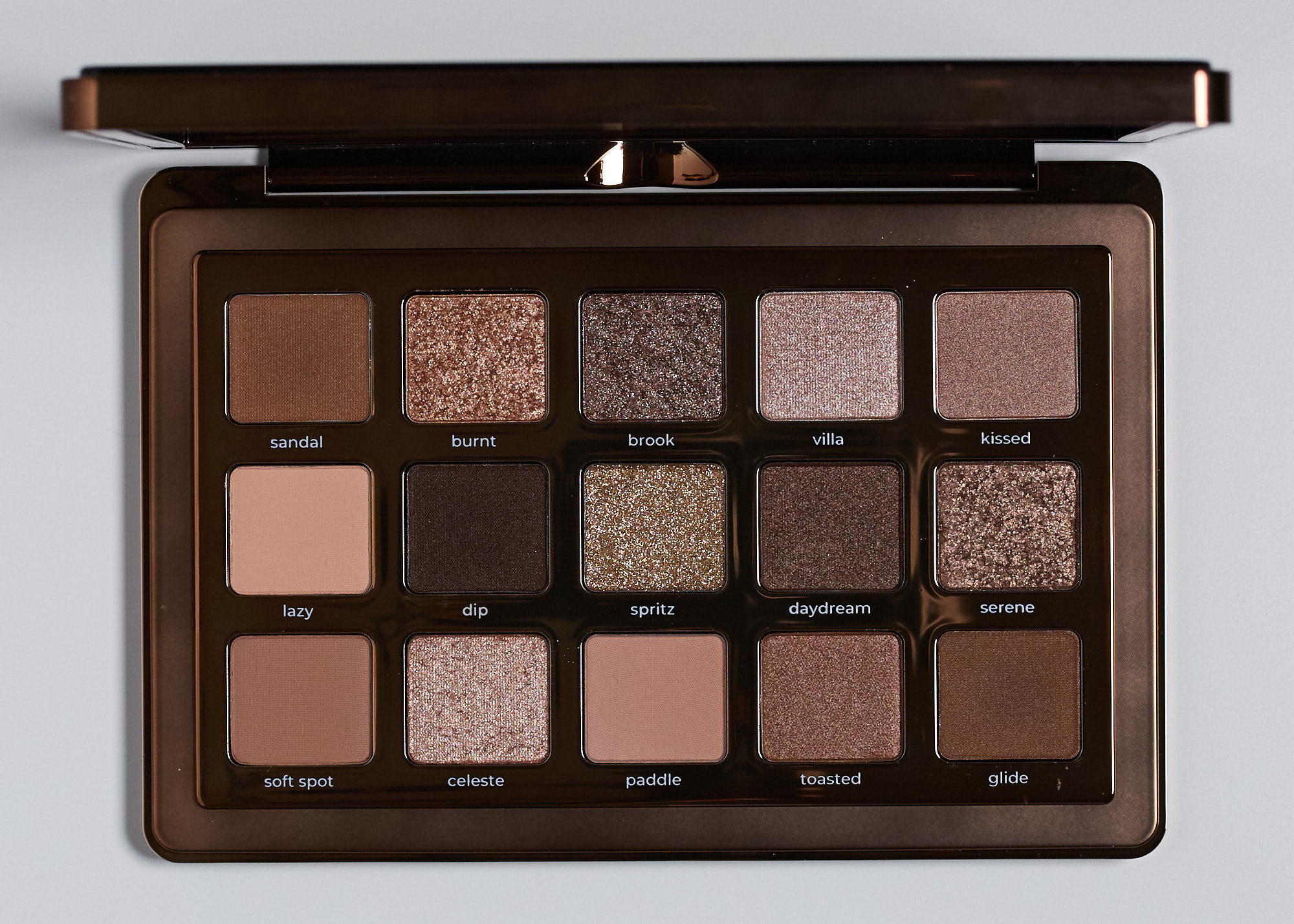
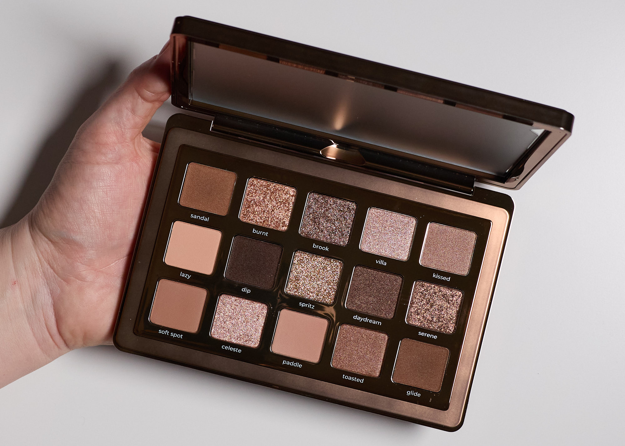
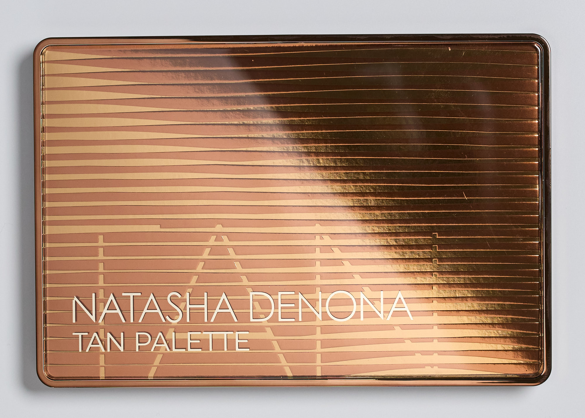
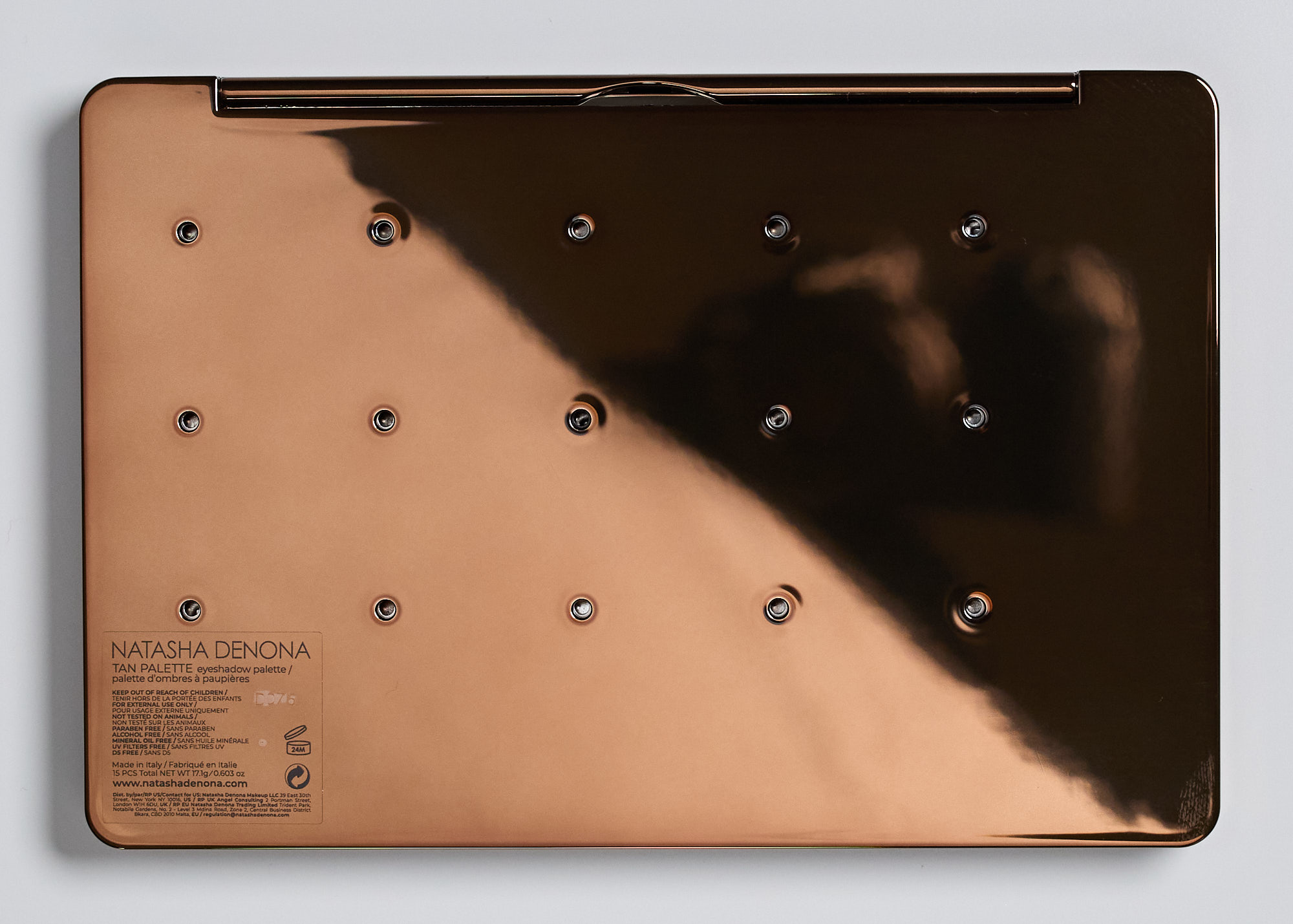
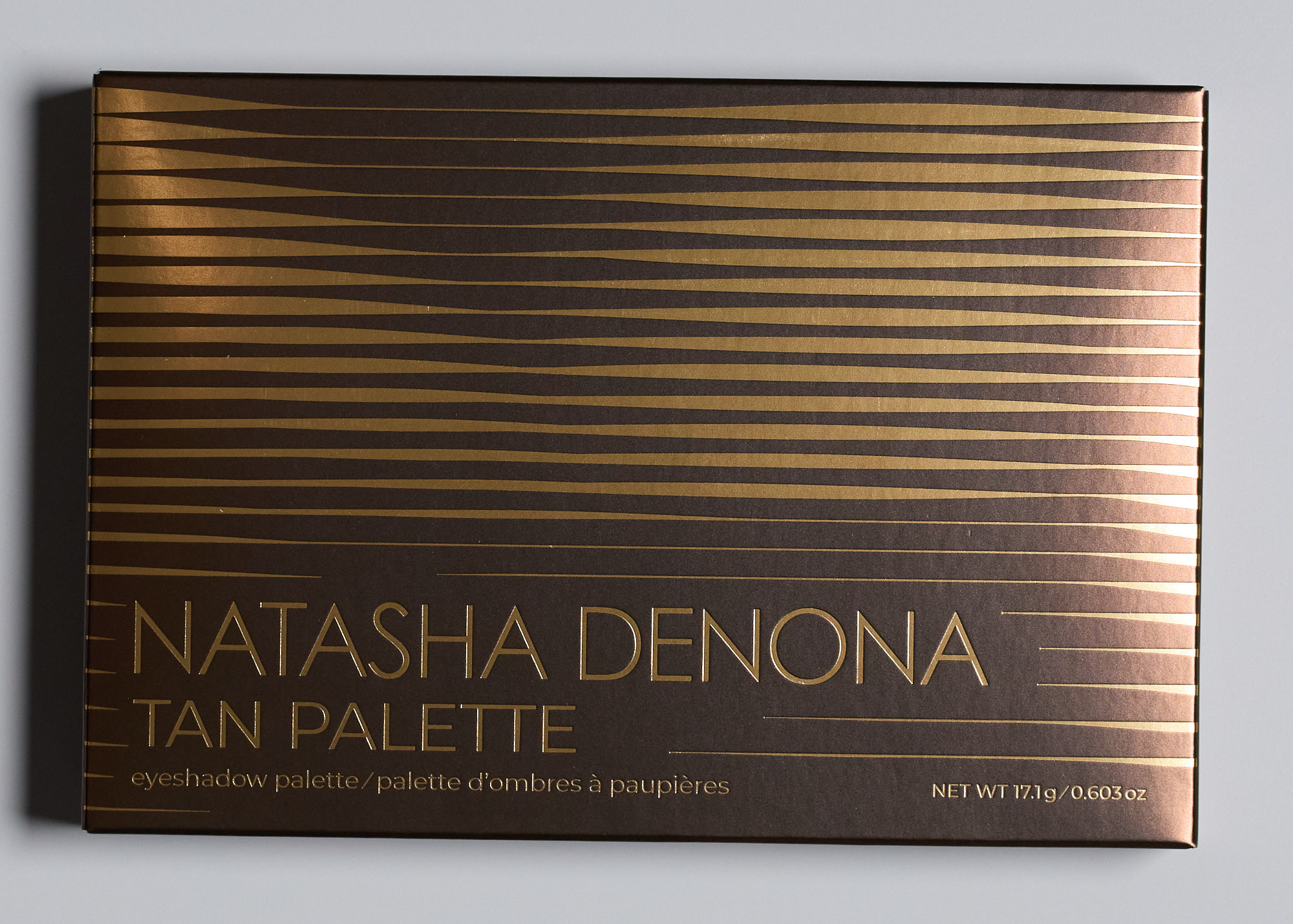
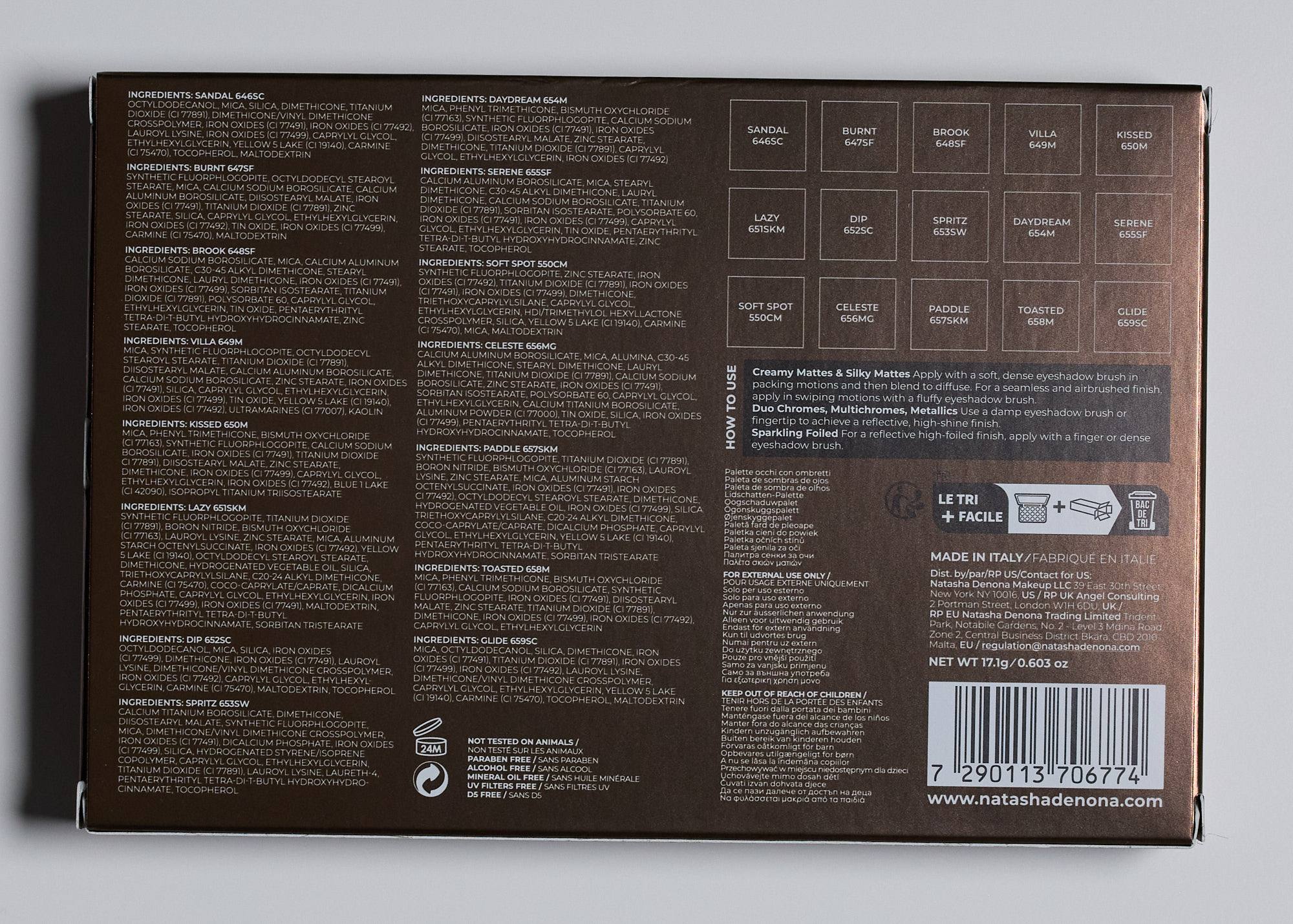
The Natasha Denona Tan Palette is a softly warm toned neutral palette with golden, peach, rosy, and olive toned shades. Compared to other neutral and warm toned palettes I’ve tried from this brand, this is one of the “less warm” warm-toned palettes and the selection of shades tiptoes lightly enough into warmth that it still feels comfortable for someone who is better suited to cool-toned neutrals. I think it could be a good option for someone that already has cooler neutral shadows and would be interested in experimenting with adding a bit more warmth. This goes for $72 and can be purchased from Natasha Denona, Sephora, Ulta, and several other large retailers.
The looks I get out of this palette read ever so slightly warm on me but I feel it fits my complexion well. For reference, the Natasha Denona I Need A Nude Palette (my review) is probably one of the best fits for my complexion and others like I Need A Warm and Golden are obviously warm on me. This one feels like a good companion to the I Need A Nude because if I wanted something slightly warmer that still feels like it fits well for me, this does that.
Looking at all the swatches together, I feel there are too many similar shades. None are exact dupes but this 15 pan palette could have been reduced down to like a 10 pan palette or even less while still offering plenty of shades to get the same types of looks. I can see how these specific shades with their subtle differences might be nice for someone that only wears these kinds of shades but if you like to play a little, the shades that are in here can start to feel redundant.
Color payoff varied from shade to shade but I didn’t feel any were TOO sheer. The slip creams are sheerer than regular powder eyeshadows but can be layered and built up easily. The true powder mattes had just the right level of pigmentation where they showed up easily while still offering that buildable quality that makes shadows easy to work with. The shimmers were the same story. Some were more opaque than others but the ones that were more sheer felt intentional and not like they were too dry or lacking in pigment. I didn’t have any trouble getting the shadows to adhere to the skin or to layer and build on themselves.
Most shades had little to no fallout. The ones I did get noticeable and somewhat annoying fallout from were Dip (deepest brown), Spritz, Villa, and Celeste. For all of these, the fallout was not bad enough to discourage me from wanting to use this palette or those shades specifically. I’d still use them but be a little more cautious (make sure to powder under the eyes extra well, tap excess shadow off my brushes, press them on more than buffing over them).
Blending was easy for all the shades. The mattes were all exceptionally easy to blend and only the most sparkly shimmers were a little more challenging to blend (mainly because blending can make fallout worse).
Swatches
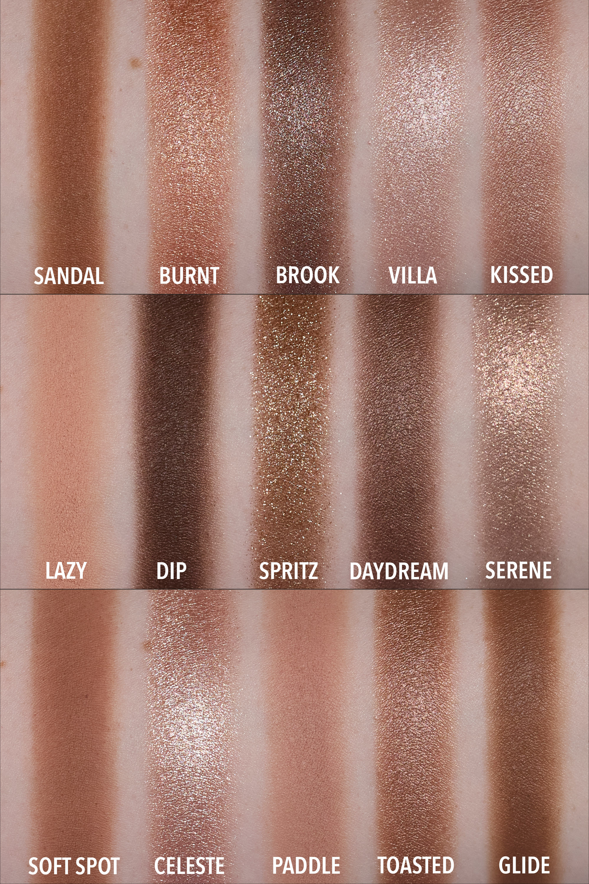
SANDAL – Slip cream. Medium brown with golden undertones. This is a cream-powder. Good color payoff, easy to build up fairly quickly, blends out super easily. Leaves a very faint dewy finish but doesn’t feel greasy or oily. Still feels mostly like a powder. Feels thin, lightweight, silky smooth, glides over the skin with little resistance. This worked well on the lower lash line, adhering well and applying evenly with good color payoff. Nice formula, I enjoyed it. Similar to Glide but slightly warmer than that one, especially if it is sheered out.
BURNT – Sparkling foiled. Light peach base color with larger copper, gold, and silver sparkles. It’s hard to tell if the base color is made of super fine shimmer, matte pigments, or a mix of both. Thicker, almost creamy feeling, but not waxy. Picked up and transferred to the lid easily and built up fairly quickly. Using this on the lower lash line, I got a very small amount of sparkle fallout. Used on the upper lid, it adhered very easily and built up pretty quickly. Fallout was minimal approaching moderate and easy to clean up. Reflect shows up well, isn’t too subtle but also isn’t blinding/foiled. It has strong opacity and I can clearly see the sparkles.
BROOK – Sparkling foiled. Deeper taupe with silver sparkle. Minimal fallout. Adheres well and builds up easily. Stays sparkly even when built up. Applying this with a brush gave me semi opaque color payoff and using a fingertip gave me closer to full opacity with this shade.
VILLA – Metallic formula. Pale nude fine shimmer with somewhat larger pale pink sparkles. The sparkles in this are smaller than in some of the sparkling foiled shades. I get moderate sparkle fallout from this which takes a bit more work to clean up than some of the other shimmers. The finish gives off a soft reflect with subtle sparkles.
KISSED – Metallic formula. Light warm taupe with a satin finish. Small amount of fallout if I wasn’t careful to tap excess off brush. Good color payoff with not much effort. Soft reflect that gives a subtle glow to the lid.
LAZY – Silky matte. Pale peach. This has enough depth to show up as a crease color on me and adds a noticeable peachy warmth. Good pigmentation. No need to spend a long time building it up. Didn’t make my lids look dry.
DIP – Slip cream. Deep brown with mostly neutral undertones. Using this as eyeliner with an ABH #12 brush wasn’t my favorite. I was able to get it to work but I got fallout and it didn’t adhere super easily to the lid. Using this again with an old Morphe angled brush, it applied slightly better as an eyeliner. It adhered better but I still got some specks of fallout. It works as an eyeliner but I prefer true powders for this. Using this on the upper lid, it has quick easy color payoff. I can do an easy sheer layer that blends out relatively evenly but if I want to build up intensity, it can take more time/effort to get it to look even. It sits nicely on the lid without looking heavy. Fallout was much more minimal using it this way.
SPRITZ – Sparkling wet. Yellow gold sparkle with a sheer cool brown base color. Minor-ish fallout when used on the inner corner with a thick eyeliner brush. Less than I was expecting. Moderate fallout when used on the center/outer lid with a slightly larger flat synthetic brush. The fallout is somewhat annoying because the sparkles are large and they kind of go everywhere. They feel lightweight and they disperse in all directions (forehead, nose, upper cheek). They don’t stick terribly but I find the fallout from this shade more annoying than some of the other sparkly shades in this palette. It has more opacity than I thought and is easy to build up to a point where it almost looks opaque. I prefer how this looks built up and not used as a wash of sparkle because the particles are kind of dark when the light is not being directly reflected off them.
DAYDREAM – Metallic formula. Sheer medium-deep neutral bronze with a satin finish. Feels firmer in the pan, not dry, not waxy. A sheerer amount of color picks up on the brush and applies color lightly and evenly to the lid.
SERENE – Sparkling foiled. Light gold and pink sparkle with not much base color. In person I can see both colors but it doesn’t pick up easily on camera. This felt firmer than Burnt (also a sparkling foiled) and was harder to pick up and transfer to the skin. It took me a while to build it up but it did adhere well. It had mild sparkle fallout used on the lower lashline. Fallout was also pretty minor and not annoying when used all over the lid.
SOFT SPOT – Powder matte. Feels less dry than Lazy which is a different type of matte. Medium brown with subtle red undertones. On me, this looks fairly neutral if I use it alone but in general there is some warmth to this shade. If I pair with Lazy, the peachiness in that shade emphasizes the warmth in this shade. This is a repeat shade that was in the I Need A Warm Palette. It has good color payoff but at the same time isn’t too intense. Easy to blend out.
CELESTE – Metal gloss formula. Pale warm nude shimmer with larger sparkle. Has a peachy base color when swatched but on my eye this looks very bright and reflects of a lot of light. Picks up and transfers easily to my lid with a good amount of intensity and shine. Feels thicker/emollient but not waxy. Used on the inner corner with a dry pencil brush, this adhered easily, applied in an evenly dispersed way, and gave me minimal fallout. Used on the upper lid, I got a bit more fallout.
PADDLE – Silky matte. Very light brown with subtle rosy undertones. Just a little bit darker than my skintone, a great depth to use as a transition shade for a low-contrast makeup look. Wasn’t too intensely pigmented but easy to build up and blend out. Not dry, adheres to the skin well, a little bit of kickup in the pan but nothing crazy, looks even on the lids. This one does look a bit warm on me but its subtle enough to feel fine with. Using this as a crease shade compared to using a combo of Lazy/Soft Soft as crease shades gives a similar look up close in photos but this looks more neutral from a distance whereas those look obviously warm on me.
TOASTED – Metallic formula. Slightly warm toned light bronze. No sparkle, all fine shimmer.
GLIDE – Slip cream formula. Medium warmer brown with golden/olive undertones. It’s like the slightly deeper sister to Sandal with less obvious warmth to it when sheered out around the edges. Very good color payoff and super easy to blend out.
Looks
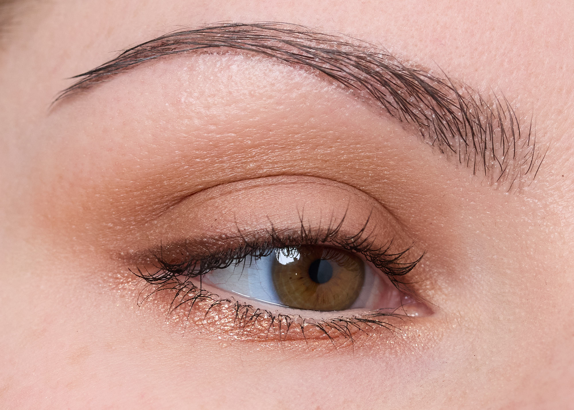
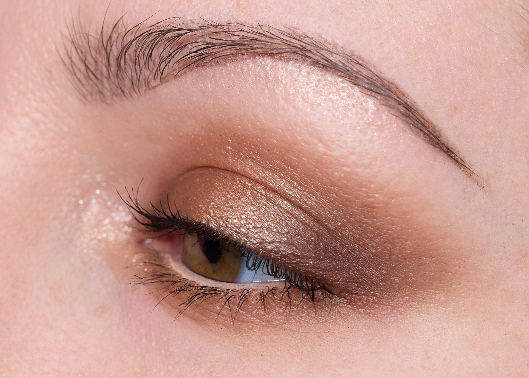
Look 1:
- Sandal – Inner/outer lid/crease
- Lazy – Center of the lid
- Dip – Liner
- Burnt – Lower lashline (dry brush)
- Morphe Bi-Liner in Give – Lower waterline
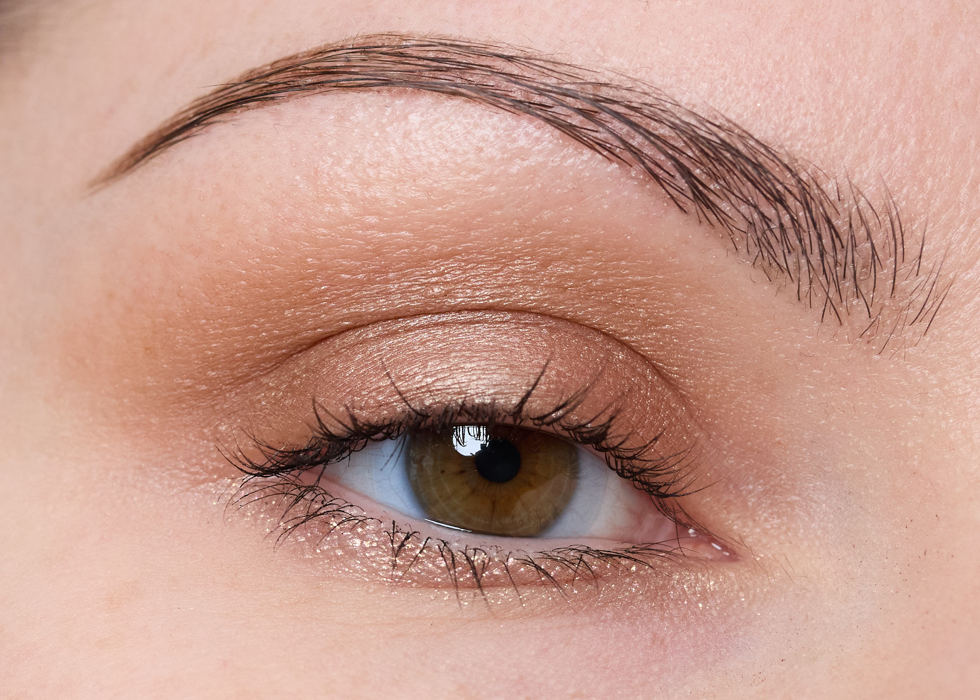
Look 2:
- Dip – Inner/outer lid
- Sandal – Crease, lower lashline
- Burnt – Center of lid (dry brush)
- Celeste – Inner corner, brow bone (dry brush)
- Morphe Bi-Liner in Give – Lower waterline
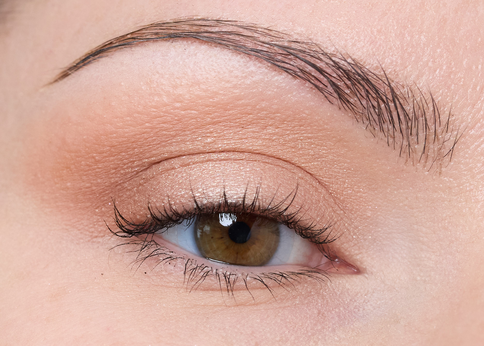
Look 3:
- Glide – All over lid, blended into crease
- Kissed – Center of lid (dry brush)
- Serene – Lower lashline (dry brush)
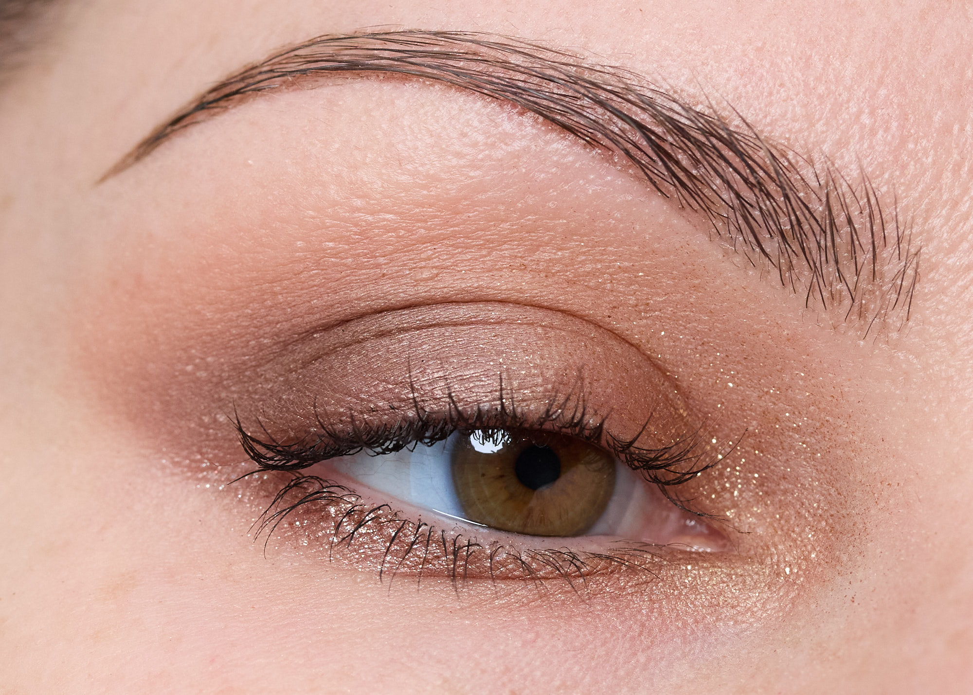
Look 4:
- Matte white shadow – inner corner, brow bone
- Lazy – Applied heavily all over lid and crease area
- Soft Spot – Outer corner
- Villa – Center of lid (dry brush + fingertip)
Look 5:
- Paddle – Crease
- Daydream – Outer lid
- Brook – Outer lower lashline
- Kissed – Inner lower lashline
- Spritz – Inner lid/inner corner
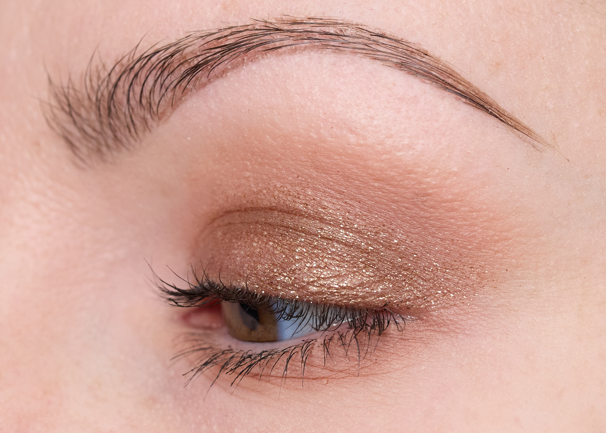
Look 6:
- Paddle – Crease, lower lashline
- Spritz – Lid (dry brush)
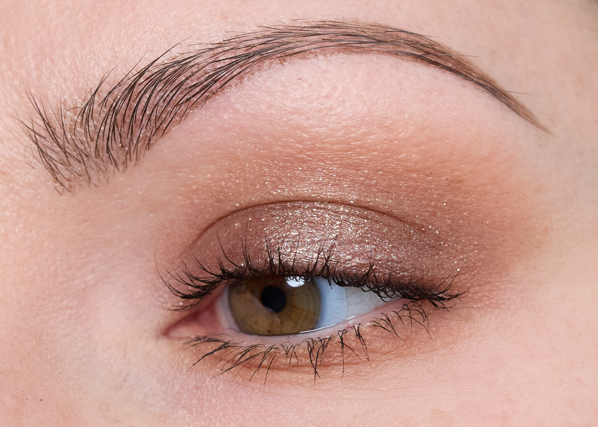
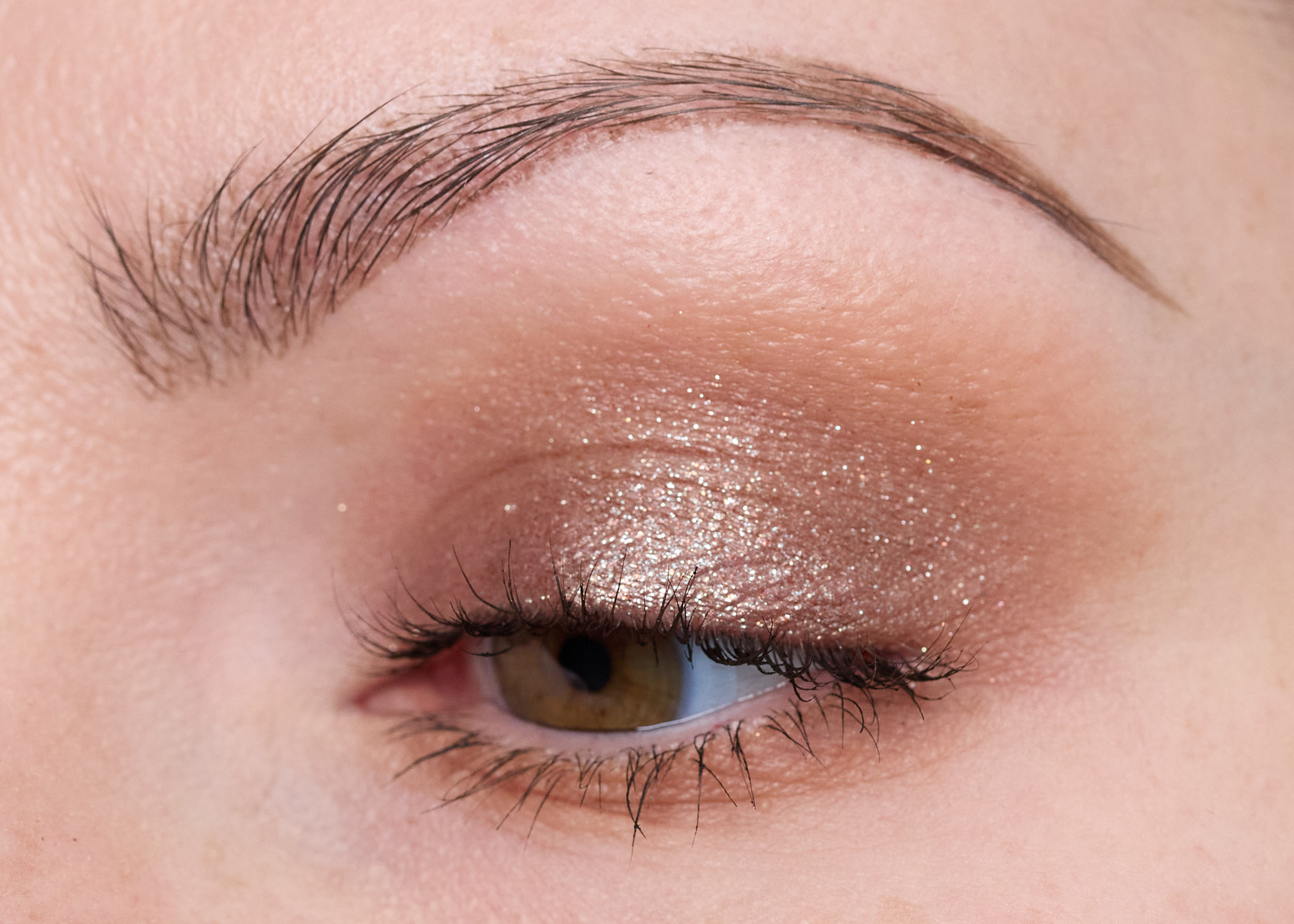
Look 7:
- Sandal – Crease, lower lashline
- Brook – Lid (dry brush)
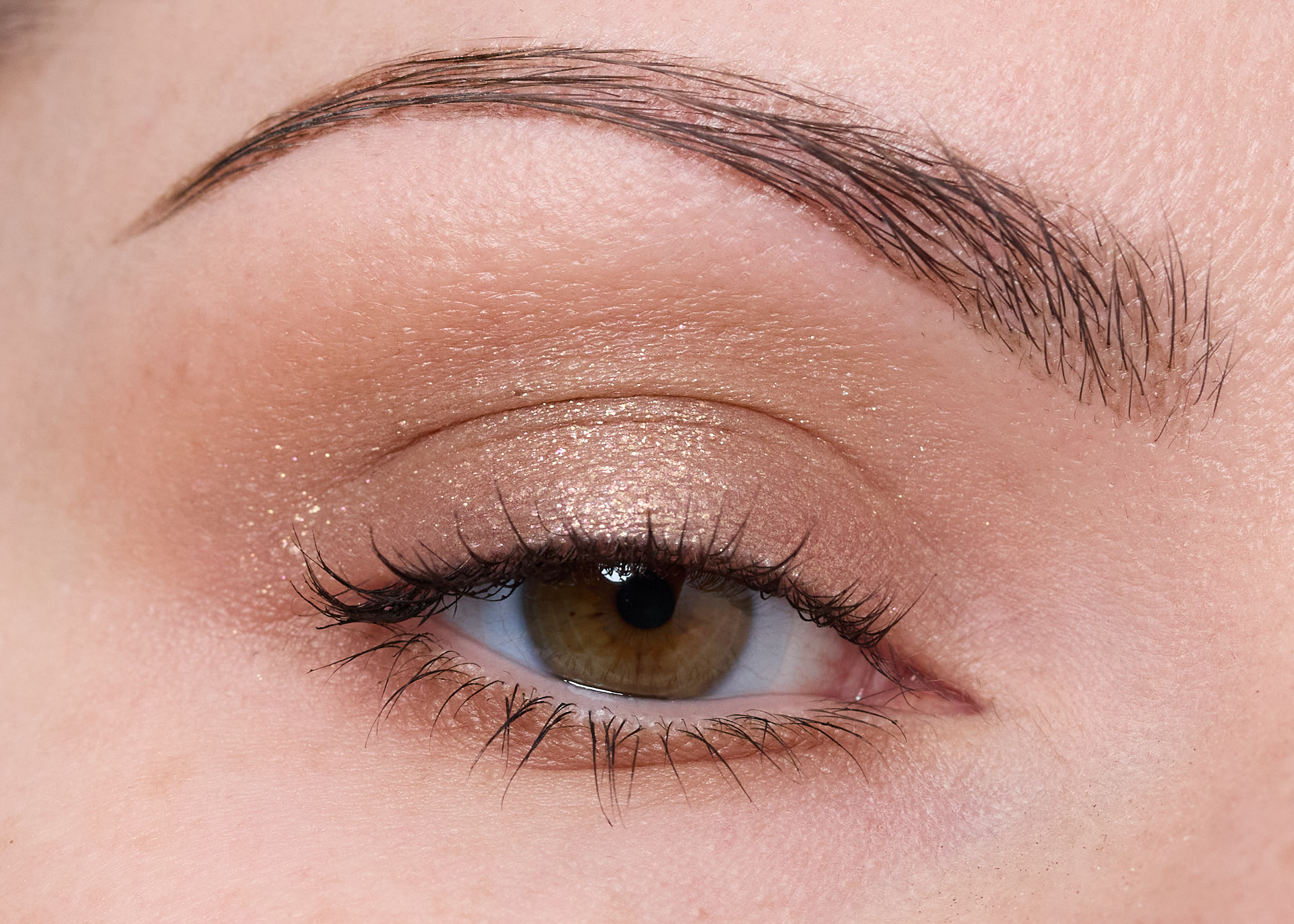
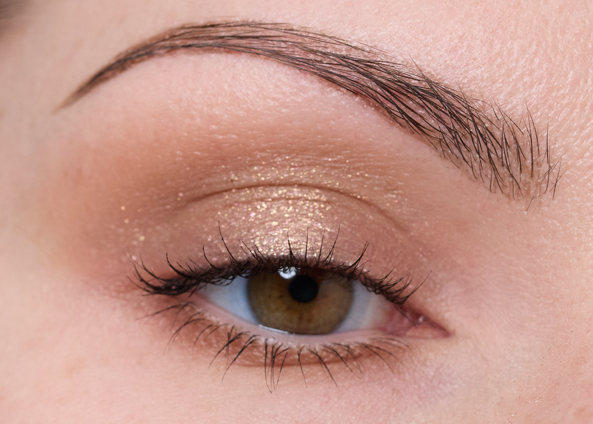
Look 8:
- Glide – Crease, lower lashline
- Serene – Lid (dry brush)
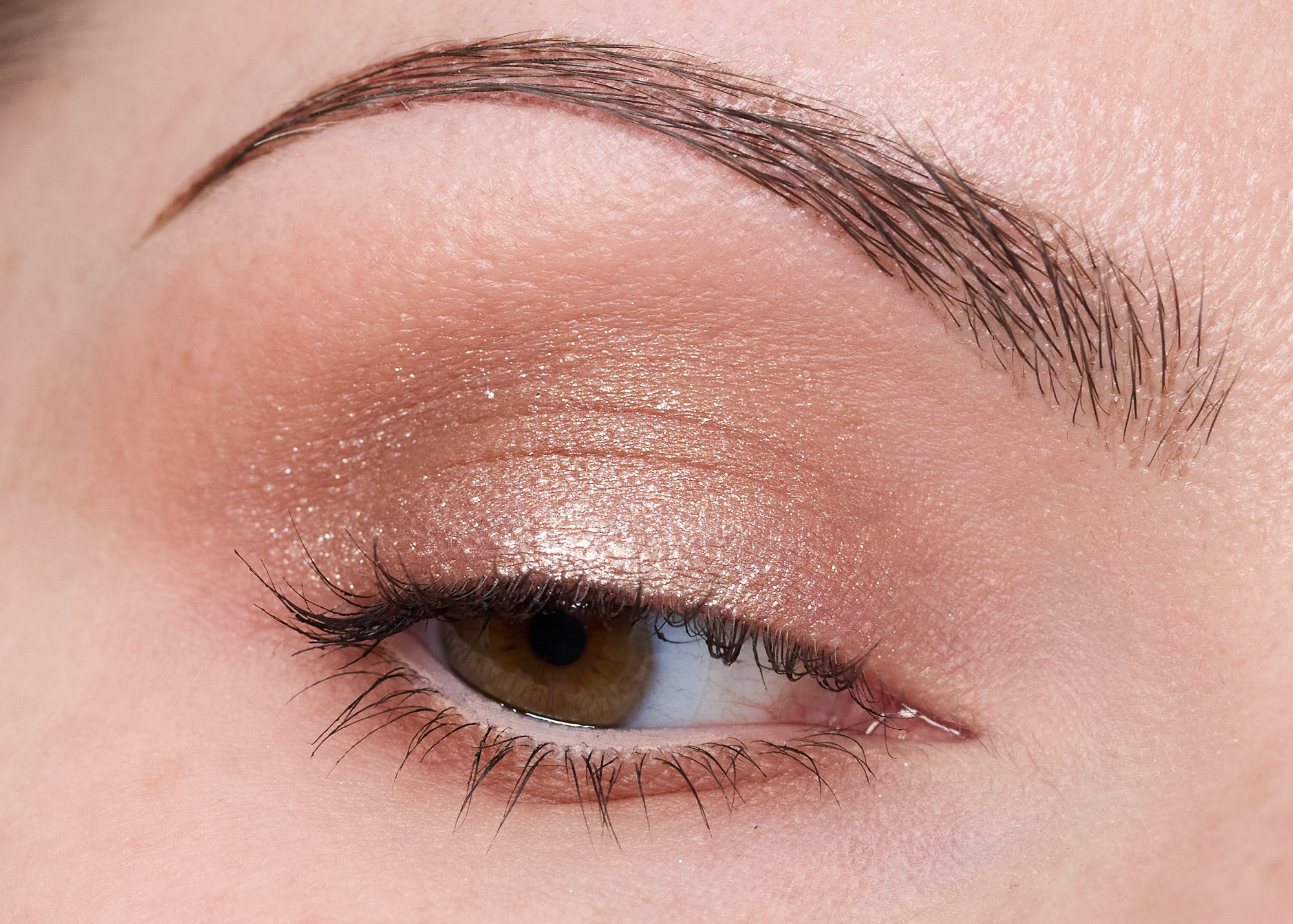
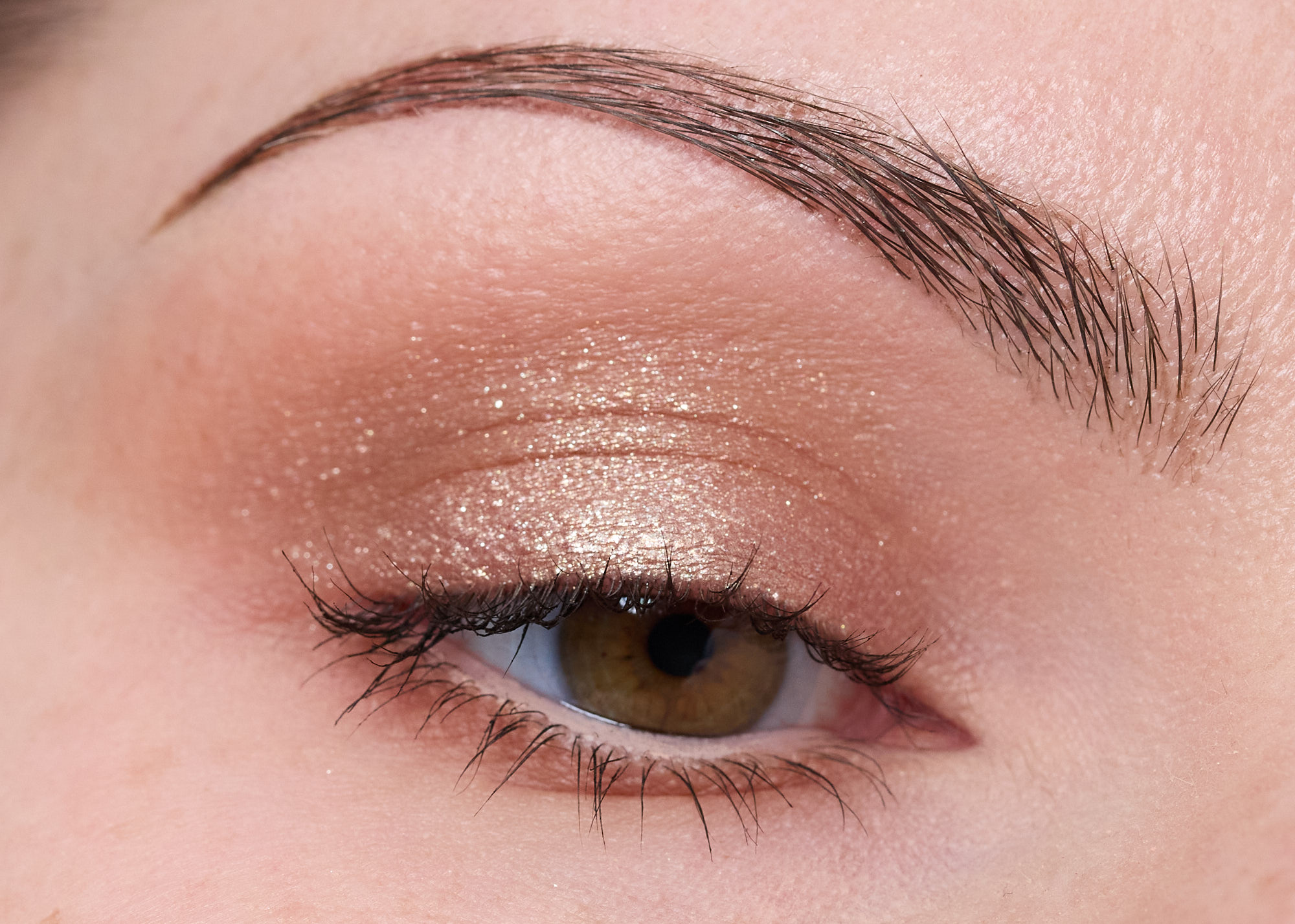
Look 9:
- Soft Spot – Outer lid, crease, lower lashing
- Celeste – All over lid (dry brush)
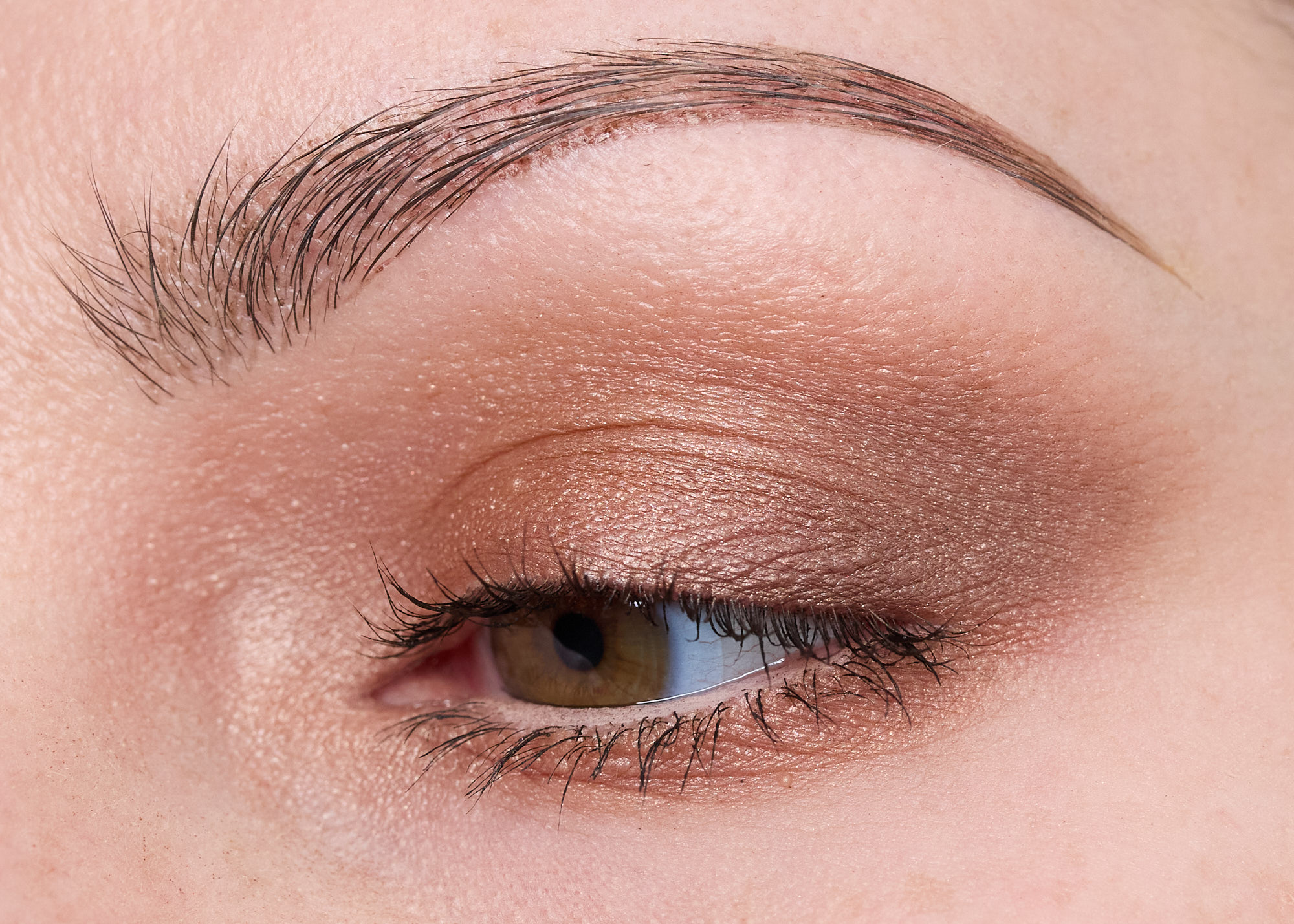
Look 10:
- Toasted – All over the lid, crease, lower lashline
- Daydream – Outer lid/crease
- Kissed – Inner corner